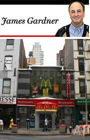
McDonald’s at 1499 Third Avenue
Most visitors to Rome rejoice in such ageless monuments as the Trevi Fountain, Saint Peter’s Basilica and the Colosseum. They’re okay, I guess, but what really impressed me on a recent visit was the McDonald’s near the Spanish Steps. Unlike the twice warmed-over, late-1970s functionalism — with a dash of color — that we New Yorkers have come to expect, this eatery boasts mosaics, waterfalls and classicizing murals that bring home the grandeur that was — and in this case still is — Rome.
I cannot honestly say that an improvement in McDonald’s New York design ever represented the burden of my prayers, but if it did, those prayers would now appear to have been answered in at least some of these establishments. For on my return from the eternal city, I began to notice a transformation, marking a great improvement in our local McDonald’s fast-food restaurants. It doesn’t even matter if, on principal, you would never dream of entering such dens of caloric consumption. The change is manifest from the outside, as is evident from the sparklingly reborn restaurant that has just been revealed at 1499 Third Avenue Near 85th Street.
Believe it or not, McDonald’s is becoming gentrified. With brightly colored, neo-modernist furnishings and décor, the place positively shrieks “Design!” Instead of primary colors, you have subtle half-tones, earth tones and nuances. Representing a striking example of how once radical forms of art seep into the mainstream of visual culture, the walls are often covered with text — mostly descriptions of food — that succeed in making the fast-food establishments look as though they were a Chelsea gallery.
There are even opulently mod arm-chairs just in case you want to purchase some coffee and read your book on Comparative Literature. It is almost as if McDonald’s were wooing the hipsters who frequent Starbucks, except that Starbucks never looked this good.
The fact that design is now officially important in the McDonald’s empire is the visual adjunct of the new corporate strategy to advertise that it is selling healthier and more diverse food. Properly understood, this change is a collective compliment to New Yorkers, if not to Americans in general: it suggests in the most material terms, in its arm-chairs, tables and décor, that we are more sophisticated than we were, and that that sophistication must be addressed if we are to frequent even such populist eateries as McDonald’s.
James Gardner, formerly the architecture critic of the New York Sun, writes on the visual arts for several publications.