There are few parts of Manhattan that have gone through as much hell
as Peter Minuit Plaza, which cozies up to Battery Park to its west as
it expands due north of the newish Staten Island Ferry Terminal. For
years now, thanks to a fundamental overhaul of the South Ferry subway
station, the place has looked like a war zone. And even when the
station itself was completed about a year and a half ago, Peter Minuit
Plaza remained in chaos as construction crews mulled about behind
their impenetrable fences.
Those have recently come down, to reveal a glinty, metallic plaza
whose most conspicuous feature is a covered bus and car pick-up area
that swerves and gleams in the mid-day sun, even as it provides
shelter from the rain.
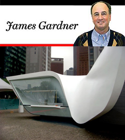
But even more recently a new form, like an alien mothership, has
landed in this area. Known as the New Amsterdam Pavilion, it was
designed by Ben van Berkel, a member of the Dutch firm, UN Studio. The
pavilion was a gift of the Dutch government to celebrate “400 years of
friendship.” Presumably all has been forgiven for our, or England’s,
having driven them out three and a half centuries ago. But surely
there is something fitting in their establishing a pavilion in the
heart of what was once New Amsterdam, even if their representative,
Peter Minuit, bought the island of Manhattan from the Lenape Indians
at the northern end, in what is now Inwood Hill Park.
The new pavilion turns out to be exceedingly Dutch, not in any
traditional sense, but rather in the sense that it is a thorough
homage to the Dutch architect Rem Koolhaas, whom many critics consider
to be the best and surely the trendiest of living architects. Like all
of Koolhaas’s recent work, it is really a resurrection of the Mod
idiom of the 1960s. Seen from above, it looks a little like an
irregular, torqued, four-pronged white propeller, each prong of which
contains a glassed-in space that dispenses coffee and tourist
assistance.
In its unacknowledged fealty to an earlier Mod style, the structure is
really historicist without quite realizing it. To say that the
structure does not match the rest of The Plaza or the other buildings
in the area is an understatement. But it is well enough made, as such
structures go, and it seems to fit in with, even to add a dash of
excitement to, its new environment.
James Gardner, formerly the architecture critic of the New York Sun, writes on the visual arts for several publications.