
Few acts of architecture seem harder — and less fun — than designing a building for a triangular New York City lot.
There are, of course, instances in which it has been pulled off with great distinction, most notably the iconic Flatiron Building. But these successes are the exception rather than the rule. Squeezing a facade into a parcel with such odd contours creates challenges for even the trendy Deconstructivist architects who currently rule the roost. As for the interior spaces of these buildings, they often
recall the internal organs of a contortionist, given how bent out of shape they are.
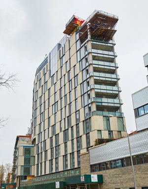
One Vandam (Photo: Max Dworkin)
Much of Manhattan’s prime real estate, of course, coincides with the borough’s more linear grid and therefore doesn’t need to adhere to these strange boundaries. But along Broadway (which intersects with Manhattan’s grid in all sorts of unusual ways) and also below 14th Street, oddities occur.
One of those oddities is at the intersection of Sixth Avenue and Sullivan Street in Soho, at One Vandam. After several years of delay, the 25-unit building is now all but finished and is set to welcome its first well-heeled residents this month, according to George Shieferdecker of BKSK Architects, who designed the building and gave The Real Deal a tour of the project.
BKSK is also the firm responsible for, among other NYC buildings, the elegantly conceived condos at 25 Bond Street, 124 Hudson Street, 77 Reade Street and Harsen House at 120 West 72nd Street.
Yet this is a tougher site than any of those. The One Vandam site and an adjacent lot were at the center of some controversy back in 2013 when God’s Love We Deliver, which provides free meals to ailing residents who are homebound, sold its air rights for $4 million. (Apparently, some did not think that the nonprofit should be among those ruthlessly seeking top dollar for their real estate assets.) The air-rights buyers, developers Quinlan Development Group and Tavros Development Partners, owned the property immediately to the north of the site.
The result of that transaction was two new buildings: a renovated and expanded home for the nonprofit and One Vandam at 180 Sixth Avenue.

George Shieferdecker (Photo: Max Dworkin)
The nonprofit’s building, designed by Gerner Kronick + Valcarcel Architects, is named after designer Michael Kors, who reportedly donated $5 million to the building and millions more to the organization. The Kors building replaced a drab, unadorned red-brick structure and is a rare example of a project that actually looks better in the flesh than it did in its renderings. In the renderings, it appeared as a drearily rectilinear sequence of mid-century floors with ribbon windows arrayed across a dull gray surface. But in real life, the building is a series of bold boxes clad in a silvery metallic surface. The architects were undoubtedly inspired by the New Museum, designed by SANAA, over on the Bowery.
As for One Vandam, its design reflects the difficulties of its urban circumstances and the irregularities of its site, which are especially tricky because it has been denied, by the nonprofit’s building, the dramatic effect of coming to a point where Sixth Avenue and Sullivan Street meet. Instead, its footprint seems more like a truncated Flatiron Building, and whatever qualities the other elements of the design possess, this limitation blunts the aesthetic effect.
Like 25 Bond, also designed by Schieferdecker, One Vandam revels in the use of stone arrayed in somewhat syncopated fashion across its facade. That pale textured Alabama stone, which was put to excellent use at 25 Bond, has a certain lustrous richness, but it does not work quite as well at One Vandam. Part of the problem is that the bulk of the structure, 11 of whose 14 stories rise over a podium, has been denied any sharp and recognizable shape. While for the most part, One Vandam has the contours of a blunted triangle, it sits at an eccentric angle and curves inward toward the north. As a result, the general cast of the facade seems somewhat inconsistent and listless.
Unlike the work the firm carried out at 25 Bond, the syncopation of the facade at One Vandam is more lumpy than energetic. It seems quite clear, to a degree that is unusual even for NYC, that the demands of real estate — in other words, creating sellable units — has gotten in the way of the design. One example is the piercing of One Vandam’s mostly stone surface with a three-story wall of glass near the center of the building’s summit. Elsewhere glass suddenly reappears in an ungainly pattern. Likewise, the seven terraces to the south and an equal number — though differently configured — to the north, may prove to be nice for buyers, but they do not sort well with the aesthetic of the building.
Other anomalies, from a purely visual point of view, include an elaborate, perforated canopy over the penthouse and the necessary but unattractive treatment of the mechanical core on the roof.
Finally, the base of the building is a fairly standard and unimaginative glass curtain wall that does not work well with the stone bulk of the building and that appears (at least visually) to prop it up with a sequence of insufficient pylons. This street-level passage will be given over to commercial space. All told, the actual facture of the building, the joining together of its many complicated parts, does not feel quite up to the level of 25 Bond.
I have no doubt that One Vandam’s 25 apartments — which range in price from $1.5 million to $28 million — will be spacious, bright and delightful to inhabit. But their floor plans often seem dizzying. Though the rooms tend to be arrayed on either side of a central spine-like corridor, they stray from it at any number of odd angles. One Vandam surely has some skillful attributes, but because of the site’s complexities, it falls short of what one has come to expect from the talented designers at BKSK.