In the last cycle, the Miami-Fort Lauderdale real estate market has given rise to audacious and groundbreaking architecture. Looking to outdo their peers and competitors, some local developers have enlisted the services of global A-list building designers such as the late Zaha Hadid, Herzog & de Meuron, Renzo Piano and Richard Meier to create whimsical glass-and-steel obelisks that will give them an edge in luring luxury buyers to their projects, while others have turned to hometown firms like Revuelta Architecture and Arquitectonica. Even mundane commercial projects such as parking garages and train depots are now getting artistic treatments, making them signature structures in South Florida.
As the cycle winds down, The Real Deal convened a panel of Miami architects to offer their insights on a handful of projects that have significantly transformed the region’s skylines and beachfronts over the past five years. Experts include the prolific and award-winning designer Kobi Karp, whose techniques were key to restoring Miami Beach’s Art Deco district, and Najeeb Campbell, a University of Miami professor
who sits on Miami’s historic preservation board. Miami Urban Development Review Board members Dean Lewis and Anthony Tzamtzis also helped to evaluate the projects based on how the state of the market and factors such as the cost of building materials impacted designs, and on how the final results appeal to the end user. Members of the panel only commented on projects with which they were familiar. The sellout figures were provided by the International Sales Group’s 2018 South Florida market report. Responses have been edited and condensed for clarity.
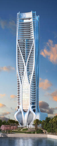
One Thousand Museum
One Thousand Museum
1000 Biscayne Boulevard
63 stories, 83 units, 60% sold
Developers: Gregg Covin, Gilberto Bomeny, Louis Birdman and Kevin Venger
Architect: Zaha Hadid
Campbell: Hadid’s design stands out from the other buildings around it. The other ones have the same forms, but she wrapped her building in an organic concrete shape that makes it one of the best-looking ones in downtown Miami. Because of her name and her brand, I can see someone spending more money on a unit in One Thousand Museum than buildings neighboring it, although I don’t see how the view from her building would be different from the other ones around it. That is an advantage it doesn’t have.
Karp: The design here is captivating. The structure resembles a human spine coursing through the outside of the body. Oftentimes, people say using concrete on the outside of a building is not something they really want to do because of the tendency of the structure to block the views, which, of course, is not a very desirable feature in a waterfront building. In this case, the units have been sold successfully because Zaha Hadid’s name adds credibility, and people want to be associated with her legacy.
Lewis: It is a stunning building: Gothically fluid in its vertical composition and attenuated silhouette. This project’s design truly pays homage to the history of Gothic architecture, Ms. Hadid herself and what truly interested her in creating a more expressive high-rise condo architecture for Miami. It’s what makes this building special and attractive to an international market.
Tzamtzis: It is definitely a signature building in Miami. Its exoskeleton is very innovative. It has a very urban design that really creates an architectural symbol in Miami. The building was presented to our board a few years back, and I remember it had a beautiful feature all the way on the top: an all-glass aquatic center that houses the rooftop pool. That is a tremendous amenity on the very last floor. However, it is flanked by two other buildings, so that may limit the views on the sides. You would buy a unit in this building because of its location, because the size of the units are very large and because of its status as a Zaha Hadid building.
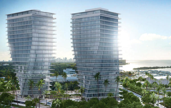
Grove at Grand Bay
Grove at Grand Bay
2669 South Bayshore Drive
20 stories, 2 towers, 95 units, 100% sold
Developer: Terra Group
Architect: Bjarke Ingels
Campbell: Developers and architects are starting to exhaust the design capabilities of the stacked-cube high-rise building, so the twist is another example of trying to re-create, reimagine or add new life to this topology that is now over 100 years old. The architect may have incorporated the twist to have some advantage for improving the views, beyond pushing the boundaries of skyscraper design. However, any high-rise that exposes itself to the elements with a skin of glass — especially the ones that face Biscayne Bay and the ocean — are a big risk when you live in a tropical hurricane zone.
Karp: It is a beautiful project, but what makes it special is how it has reinvigorated the area and created a desire to live in Coconut Grove again. As he did with Eighty Seven Park in North Beach, [Terra Group developer] David Martin looked at the Grove in a way no one else had previously conceptualized. He created these full-glass buildings with a forward-thinking design and spared no expense to realize his vision. The way the towers are shaped at Grove at Grand Bay creates a statement. Given the prices buyers have paid per square foot, it has become obvious that there is a high demand for buildings like Grove at Grand Bay, and I would expect to start seeing similar projects start to take shape in the neighborhood and beyond.
Lewis: Mr. Ingels successfully employed the twisting-towers illusion by simply rotating the outer square profile of the concrete floor slabs sequentially. The power is in the drama and the unsuspecting sculptural quality and dialogue created between the two towers. It brings to mind two sailboats jousting in the wind, each with their billowing spinnaker sails. The static cube volume comes alive with its segmented rotation of glass and concrete slabs as you move up the spine of the buildings. You also have 11-plus-foot, floor-to-ceiling heights in the units, which beats the majority [of other luxury buildings in the market] and justifies higher price points.
Tzamtzis: The location of the project and the shape of the towers is what sells this building. The continuous glass façade and the rotation of the floors allows for beautiful views of the bay.
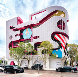
Design District’s Museum Garage
Design District’s Museum Garage
Northeast 41st Street and Northeast First Avenue
Developer: Craig Robins, DACRA
Architects: WORKac, J Mayer H, Clavel Arquitectos, Nicolas Buffe and Keenan/Riley
Campbell: I don’t see the design concept attracting a high-end clientele per se. I see it accomplishing something fun and artistic. Design District developer Craig Robins is a big fan of the arts and I see him paying homage to the art world, which does have a high-end element to it. I see it as an individual choice by a developer who has a certain individual taste.
Karp: It is a wonderful and creative architectural solution. Creating artwork on the vertical walls of the garage obviously increased the cost of the structure, but it also created an urban fabric that can’t be dismissed. Its creators made something that people want to come and look at, and by design created a destination. The garage is now part of the community, rather than just a service building.
Lewis: Here, the developer basically gave a collection of architects an opportunity to decorate the concrete frame of a huge parking garage. Each architect gets a certain span of façade to work with and to articulate a different concept. It is all about the gestalt: The sum of the parts is more interesting than the whole. I think it is successful in the way it is knitted into the fabric of the Design District. It is well situated in the southern boundary, right up against the highway overpass. It buffers the pedestrian experience at the lower street level, as well as creating an interesting experience as a driver passing those façades at an urban scale.
Tzamtzis: Using art to enhance areas that are occupied by cars is really wonderful. It fits very much in the overall artistic environment of the Design District’s urban setting. It is a good example of good use of art as a way to alleviate blank surfaces or surfaces that have to shield or ventilate parking garages. Anything we do to enhance the appearance of building areas and surfaces for parking is a very positive thing, especially in areas that have the flair for architecture and design that call for this type of strategy with our buildings.
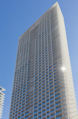
Jade Signature
Jade Signature
16901 Collins Avenue
57 stories, 192 units, 96% sold
Developer: Fortune International Group
Architect: Herzog & de Meuron
Lewis: There is an organic totem carving of the building’s columns that is its signature. You see a skeletal carving or wind-blown effect on the columns and unit demising walls [the partitions that separate one unit from another] that rise up the building’s floor plates, generating unique profiled views of the ocean at each unit. It gives Jade Signature an organic, biomorphic quality that is appealing. This is otherwise a very rational, simple, rectangular floor plate building.
Karp: Jade Signature is the latest edition in the Jade trifecta, joining Jade Beach and Jade Ocean. This final building is unique, from the basement parking lot to the project finishes. It is a luxurious product that is doing well despite the myriad of new projects in Sunny Isles Beach.
Tzamtzis: In terms of overall exterior appearance, I don’t see anything particularly unique about the building. Its layout is very conventional; very massive and monolithic. It is a big rectangle sitting on the beach. There is a whimsical design on the columns that distinguishes the building a little, although it reflects market demand in terms of the angles of the units facing the ocean and the large balconies.
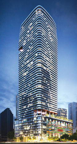
SLS Lux Brickell
SLS Lux Brickell
805 South Miami Avenue
57 stories, 450 units, 100% sold
Developers: sbe, the Related Group and Allen Morris Company
Architect: Arquitectonica
Campbell: Some buildings in Brickell don’t have the sophistication that Arquitectonica can bring to the table. It’s the hometown team, but with international experience. The SLS Lux has more substance for the discerning buyers than other new buildings in the neighborhood. Yet I don’t see any great acrobatic moves to get superior views than the other condominiums in Brickell and downtown Miami.
Lewis: This a perfect example of the SLS reputation and architecture coming together for a powerful expression. The integrated art and how the building presents itself to the street is what makes it stand out. There is very good drama there. At night, the way the building reflects its signature glass balcony corners’ shifting diagonal pattern on the façade gives the building a unique and powerful skyline presence. Arquitectonica got tremendous mileage from that simple detail. The firm is a master at simplified, very organized plans while working in the drama with a few clean simple moves on the façades at a larger scale that is always a welcome pleasure on a larger urban scale. It makes for effective, iconic architecture.
Tzamtzis: It is right in the center of Brickell’s explosion of outdoor activities. It has a beautiful illuminated design, and the way the balconies rotate creates an exterior identity to the building at day and night that is very unique.
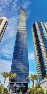 Muse Residences Sunny Isles
17141 Collins Avenue
47 stories, 68 units, 87% sold
Developers: Property Markets Group and S2 Development
Architects: Carlos Ott and Sieger Suarez
Lewis: It’s a slight twist on the typical rectangular tube silhouette. The shape at the top has an energy and originality to it that is attractive. There are some structural dynamics here that we have learned to master over the past 20 years. In the renderings, the tower relies tremendously on the success in the sophistication of the glass and the glazing. It’s very seductive. At the same time, looking at the completed tower, you are missing the implied color, tints and translucent effect in the glazing, a skin that is most intriguing in the renderings. That changed along the way in the design development process. It has a different energy in its built form — a bit more office-like than luxury condo residential use. I think it was a difficult site sandwiched between two adjacent towers.
Tzamtzis: Muse is a remarkable building that has a small footprint. It is the more sculptural building in the stretch of new condominiums in Sunny Isles Beach. The elegant curvature stands out. It has a very high parking podium facing Collins Avenue that one could find objectionable, but it also looks very elegant. It is also a more intimate building. For instance, Jade Signature has four times the units. Muse has the same advantages when it comes to providing great views, while also being very sculpturally prominent.
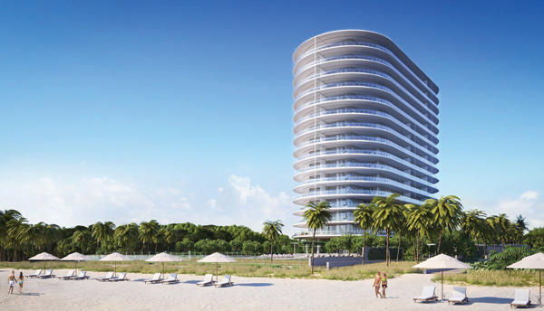
Eighty Seven Park
Eighty Seven Park
8701 Collins Avenue
18 stories, 66 units, 70 percent sold
Developers: Terra Group, Bizzi & Partners Development, Great Eagle Holdings and New Valley
Architect: Renzo Piano
Karp: Eighty Seven Park pays homage to the famed Miami Beach architect Morris Lapidus, who designed the original building that was demolished to make way for this new structure. The impression that the tower is floating over green space is the strongest design statement anyone could have made. It’s a spectacular project and I love the detailing, such as the overhangs of the balconies. This is not simple or inexpensive. To do this properly requires a higher cost per square foot and strong, quality workmanship from the contractors.
Lewis: What sets it apart from other buildings on Collins Avenue is not the form of the building, but instead the extremely high level of detailing put into the balcony profiling and the glazing. Mr. Piano is a true master of engineering his architecture in a more poetic, refined manner. It evokes a very nautical imagery in the design that is refreshing and a step above similarly shaped buildings.
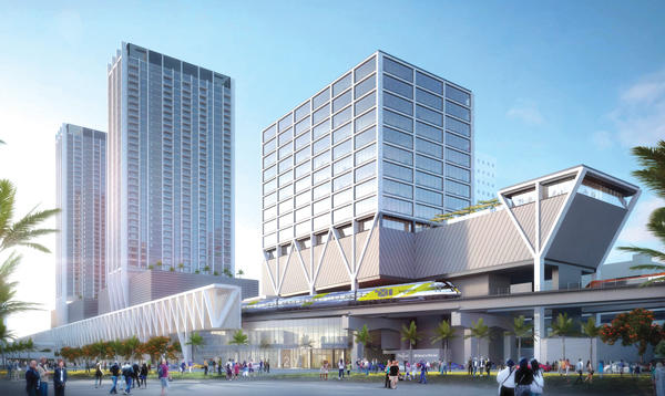
Miami Central Station
MiamiCentral Station
604 Northwest First Street
Developer: Florida East Coast Industries
Architect: Skidmore, Owings & Merrill
Lewis: The inverted triangular trusses is the design element that connects each primary train station, whether it is Miami, Fort Lauderdale or West Palm Beach. I think that is good — there is a refreshing edge to it. Each site lends itself to a better expression of that architecture. MiamiCentral’s site is more compact and narrow, which doesn’t allow the selected vocabulary to express itself as well as it did in West Palm Beach. The office building at MiamiCentral is inherently more interesting as a mixed-use project.
Tzamtzis: The entire hub is the new Miami. It is an area that has a potential that has not been fully understood or e
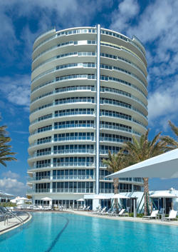
Paramount Fort Lauderdale
xploited yet. I think its vicinity to the downtown area and modes of transportation are positive elements. It is designed to attract corporate users and individuals who have a need for commuting longer distances. It is a totally different feeling from a building on South Bayshore Drive, where you have zero public transportation but have a nice pedestrian environment. MiamiCentral is much more urban in nature.
Paramount Fort Lauderdale
701 North Fort Lauderdale Beach Boulevard
18 stories, 95 units, 85% sold
Developers: Dan Kodsi, Art Falcone and Nitin Motwani
Architect: Luis Revuelta
Lewis: What Mr. Revuelta does again successfully here is create a clear balcony span. It has nice, wide Paris balconies. The railing systems and the edges are more sophisticated than the typical concrete slab sticking out like an open drawer. The building is large in girth, and Botero sculpture-like, which is separate from Mr. Revuelta’s previous condo towers. It seems there was a limitation in height, and a wider site that justified a larger massing more similar to the scale of the rear of a mega cruise ship, which is also an appropriate imagery. It is a “Botero-esque” solution.
