The 1980s were a particularly uninspired time for Bay Area design, according to local architects. When asked for their most- and least-favorite local buildings, all three had picks designed during the Reagan administration on the bottom of their lists.
Lada Kocherovsky, principal with Page & Turnbull, also chose to concentrate on what could still be at one of her least favorites: the Crocker Galleria. A plan for a major renovation to the early 1980s downtown mall was pitched to the Planning Department in 2019 but seems not to have moved forward since then. Kocherovsky remains optimistic.
“I do hope something nice comes of it,” she said.
Lada Kocherovsky AIA, Principal with Page & Turnbull
Kocherovsky has been a principal at Page & Turnbull for over 25 years and has worked on commercial and civic projects ranging from the adaptive re-use of historic buildings at UC-Berkeley and Stanford to the creation of the Walt Disney Family Museum in the Presidio.
Favorites
1645 Pacific Condominiums
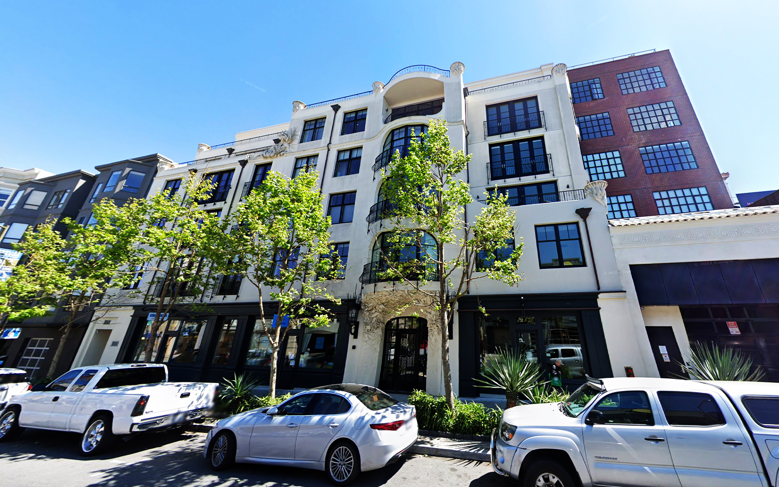
Kocherovsky couldn’t resist a few Page & Turnbull shout-outs to kick off her list, first citing this Grosvenor-owned project completed in 2013. Designed by BAR Architects, the Nob Hill development was based on an initial concept design sketch by Page & Turnbull.
“It’s one of those rare examples of a housing project that doesn’t look like the rest,” she said of the former 1907 garage whose historic facade was integrated into the mid-rise condo building.
San Francisco Ferry Building
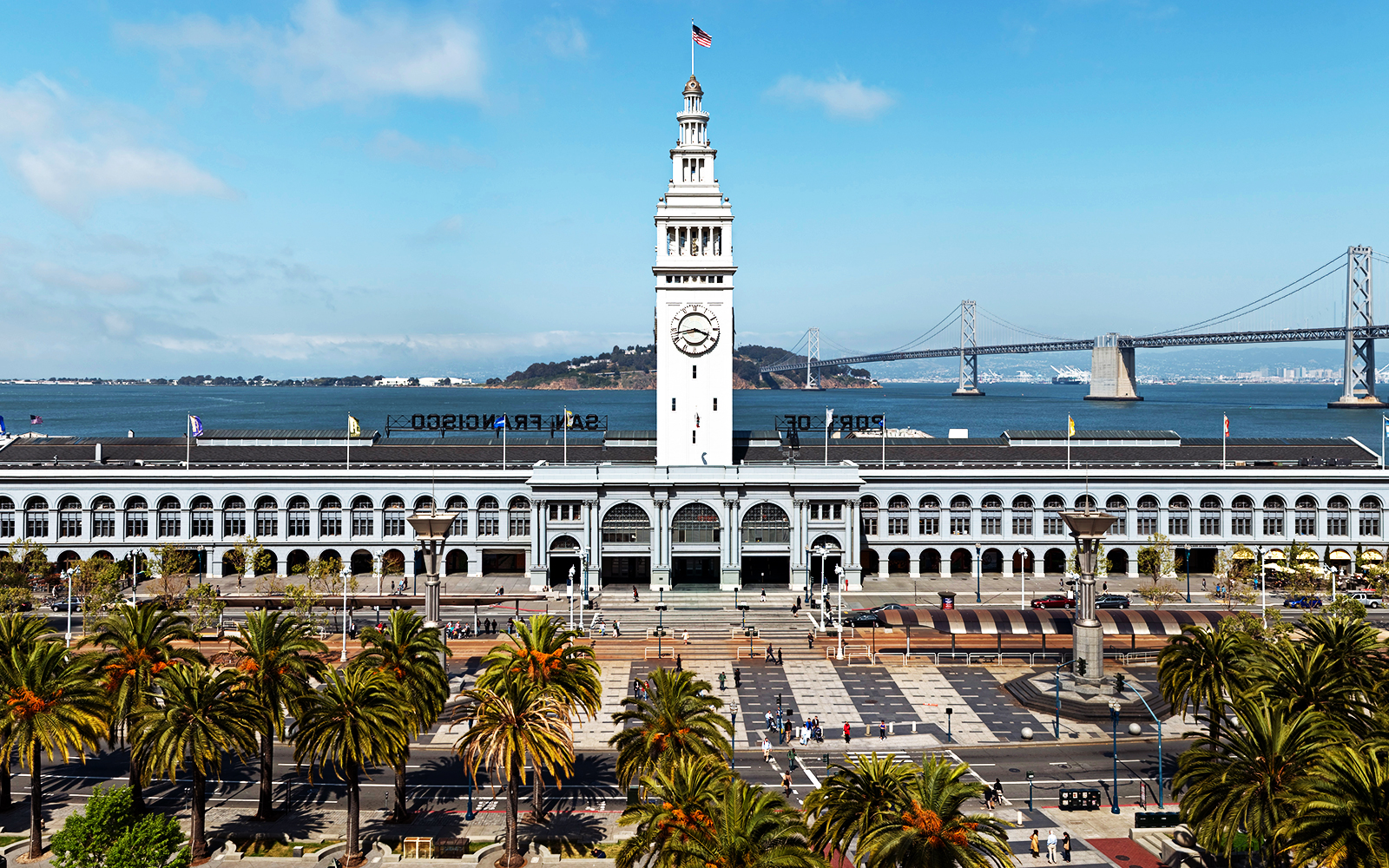
Kocherovsky called the historic Embarcadero building a “quintessential San Francisco landmark and an icon, a symbol of the city.” Page & Turnbull oversaw the Ferry Building’s major restoration in 2003, and is leading a current renovation project, which will add a bayfront plaza, indoor-outdoor dining, pedestrian pathways and new retail spaces. Another restoration from Architectural Resources Group that involves repairing some of the structure’s façade and a new paint job in custom-made “Ferry Building Grey” began in 2019.
Kochervosky said the 1898 building was the city’s “immortal phoenix of real estate, with the remarkable rebirth of the building in the early 2000s, when it became something it wasn’t ever before without losing itself. That gave the Ferry Building a new life, and it could happen again now. It’s a commercial real estate success story.”
181 Fremont St.
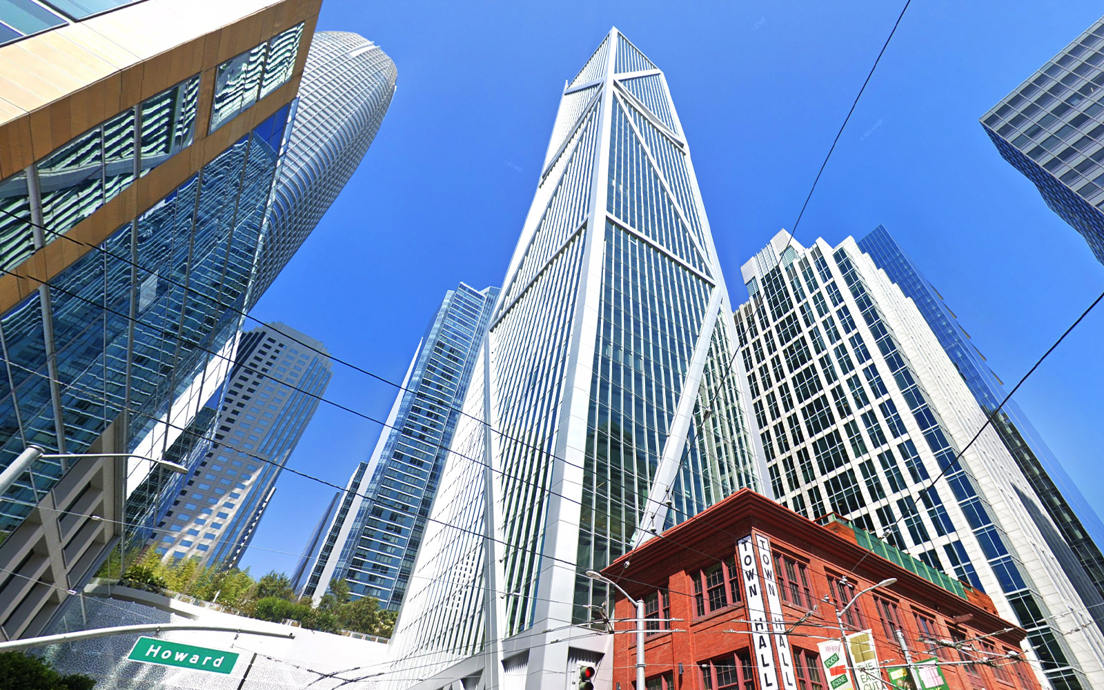
For her last pick, Kochervosky gave kudos to Heller Manus Architects’ design of the LEED Platinum luxury condo tower, completed in 2018 and developed by Jay Paul Company.
“The San Francisco skyline has changed a lot over the last few years, and the Fremont Street high-rise with its expressive diagonal element recalls the towers of 1950s and 1960s architecture in San Francisco, yet it is appealing as a contemporary gesture,” she said.
Least Favorite
Crocker Galleria
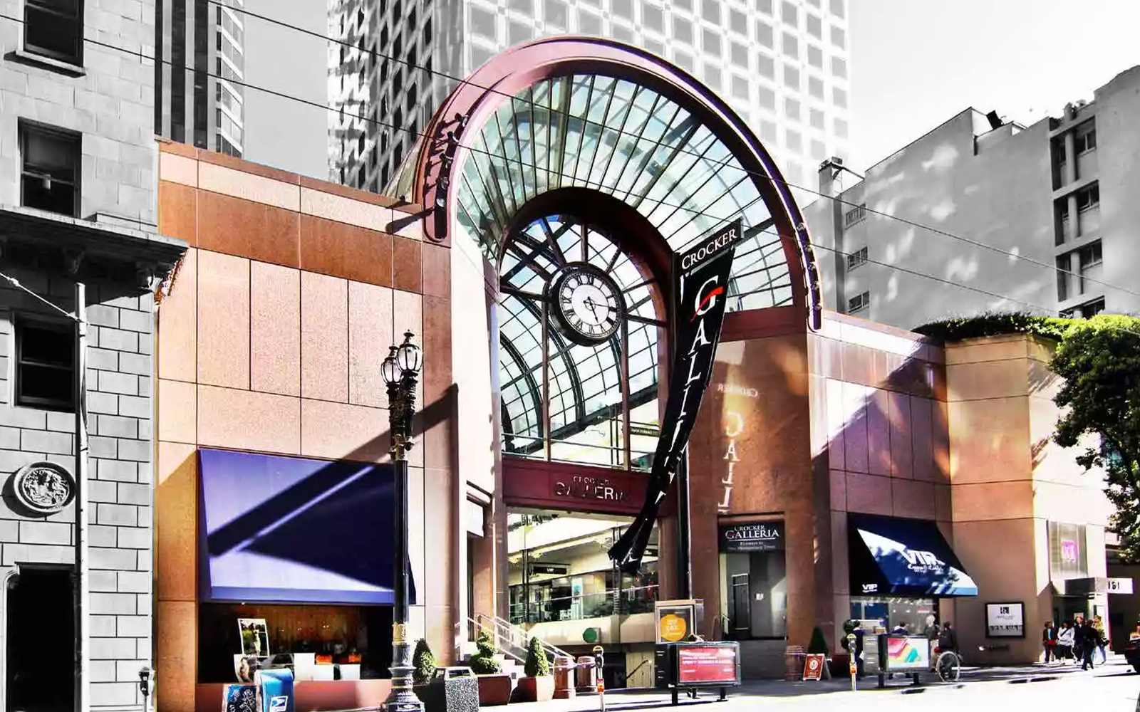
Kochervosky called this downtown mall “the opposite of a love-at-first-sight building” that “reminds San Francisco of the worst of the typical 1980s, and the least appealing aspects of postmodern architecture. It’s kind of an eyesore to me, and I’m glad they’re talking about redeveloping it.”
San Francisco Marriott Marquis
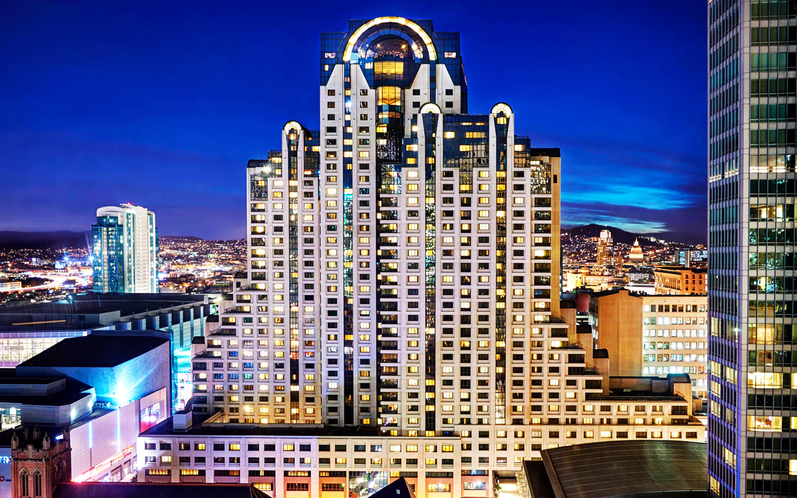
Another ‘80s build made it onto Kochervosky’s least favorite list: the 39-story Marriott Marquis across the street from the Moscone Center. It had its opening day on October 17, 1989, the same day as the disastrous Loma Prieta earthquake.
Kochervosky called the city’s second-tallest hotel tower a “child of its times” that “dominates central Market-Mission streets with its stepped façade, reflective glazing and arched penthouse windows — though not in a particularly attractive way.”
Federal Building
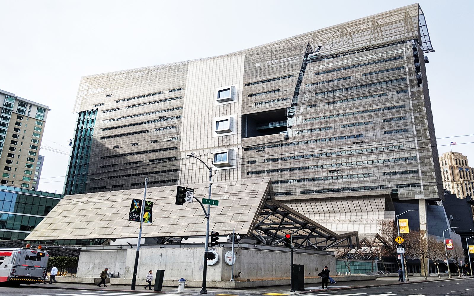
This 18-story SOMA tower was designed by Morphosis and completed in 2007. It is the first LEED-certified federal building, with perforated stainless steel panels that are supposed to naturally regulate the building’s temperature rather than a traditional HVAC system.
The innovative environmental features led to a design award from the American Institute of Architects’ San Francisco chapter in 2008, but Kochervosky was not won over.
“Its scale is wrong,” she said. “Nor does it relate to the adjacent architecture in any way. So it’s just not a great fit in the neighborhood.”
Charles Bloszies FAIA, Founder and Principal at the Office of Charles F Bloszies
Bloszies has led his own San Francisco-based office since 1985 and specializes in projects that merge old buildings with new designs, like his 10-story 2009 addition at 1 Kearny Street. He had a best and worst list, as well as an architectural “wildcard”: the Cow Palace, the former livestock pavilion and current event center on the San Francisco/Daly City border that he called “the most un-San Francisco building imaginable.”
Favorites
Angler’s Lodge
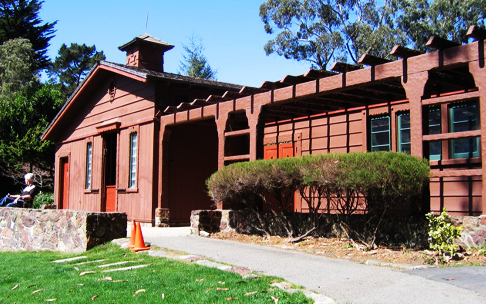
Bloszies thinks more people should check out this “hidden gem” adjacent to the casting pools in Golden Gate Park. Both the lodge and pools were built as part of a Works Progress Administration-funded project in the late 1930s. The building is meant to mimic traditional mountain lodges, with rustic woodwork and stone and houses a library of books and media on fishing and casting, according to the Golden Gate Angling and Casting Club website. The club still hosts tournaments and fly fishing classes, with rods available to borrow.
Hallidie Building
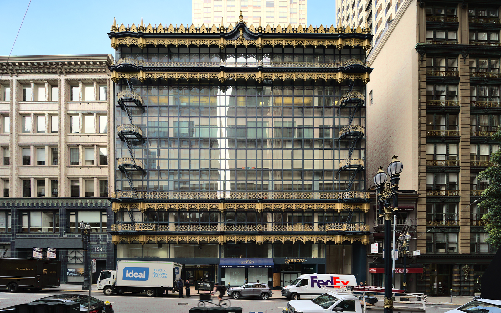
“According to legend, everyone hated” this Willis Polk-designed downtown building when it was finished in 1918, Bloszies said. But it was one of the first to utilize glass curtain walls in the U.S. and “planted the seeds for the modern era of glass and steel architecture,” he added.
It now sits on the city’s list of registered landmarks and underwent a three-year historic renovation beginning in 2010 that fixed up its sheet metal decorative elements, repainted it to its original blue and gold color scheme—in honor of its first occupant, the University of California — and replaced all the glass. It currently houses the San Francisco chapter of the AIA.
8 Octavia Condominiums
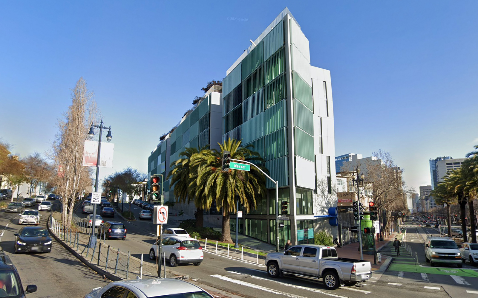
Stanley Saitowitz’s 8 Octavia is “one of a very few sustainable buildings to use sun control as a design driver, expressed by its over-scaled vertical blinds, and by far the best residential building built in the Octavia Corridor,” Bloszies said.
The corridor used to be part of the Central Freeway, which was demolished in 2003 after being damaged during Loma Prieta. Recently, State Senator Scott Wiener has been among those calling for the removal of more of the freeway overpass to make room for more housing, but has faced pushback from neighborhood groups fearing gentrification.
Least Favorite
Sutro Tower
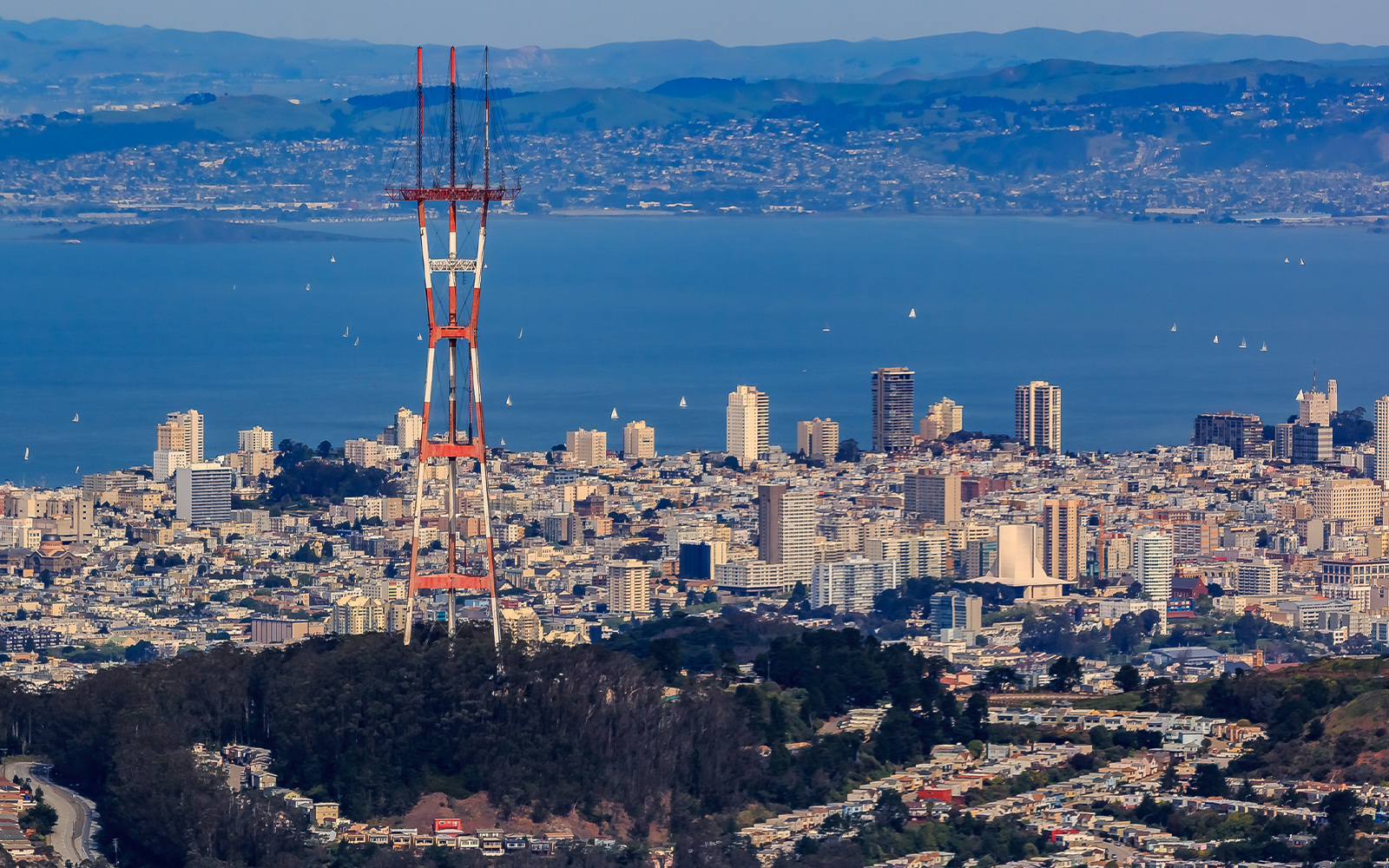
Bloszies acknowledged that in the 50 years since Sutro Tower went up near Twin Peaks it has become “a revered icon for some, but not for me.”
“It was ugly when it was erected and getting uglier as it is adorned with more and more cell antennae,” he said.
900 Kearny Street
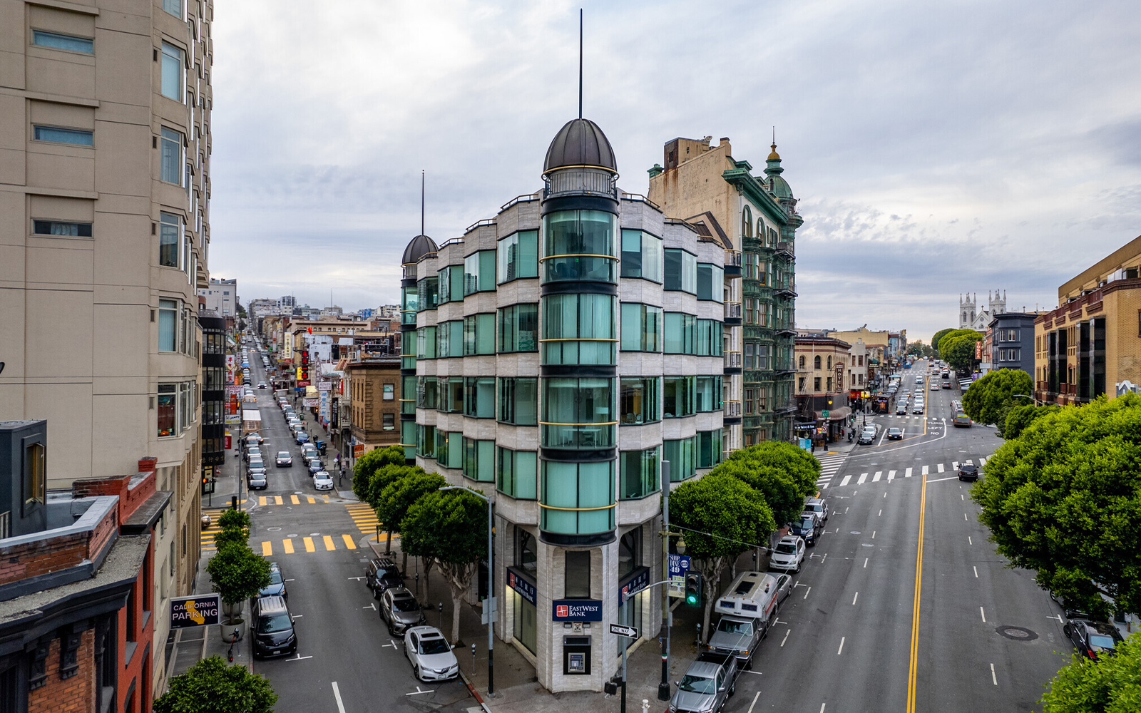
Bloszies said the Francis Ford Coppola-owned Columbus Tower, built in 1907 and also known as the Sentinel Building, is an architectural beauty. But the neighboring tower at 900 Kearny Street, built in 1989, “makes a feeble attempt to mimic the Columbus Building and represents the worst type of new:old architectural references.”
100 Van Ness
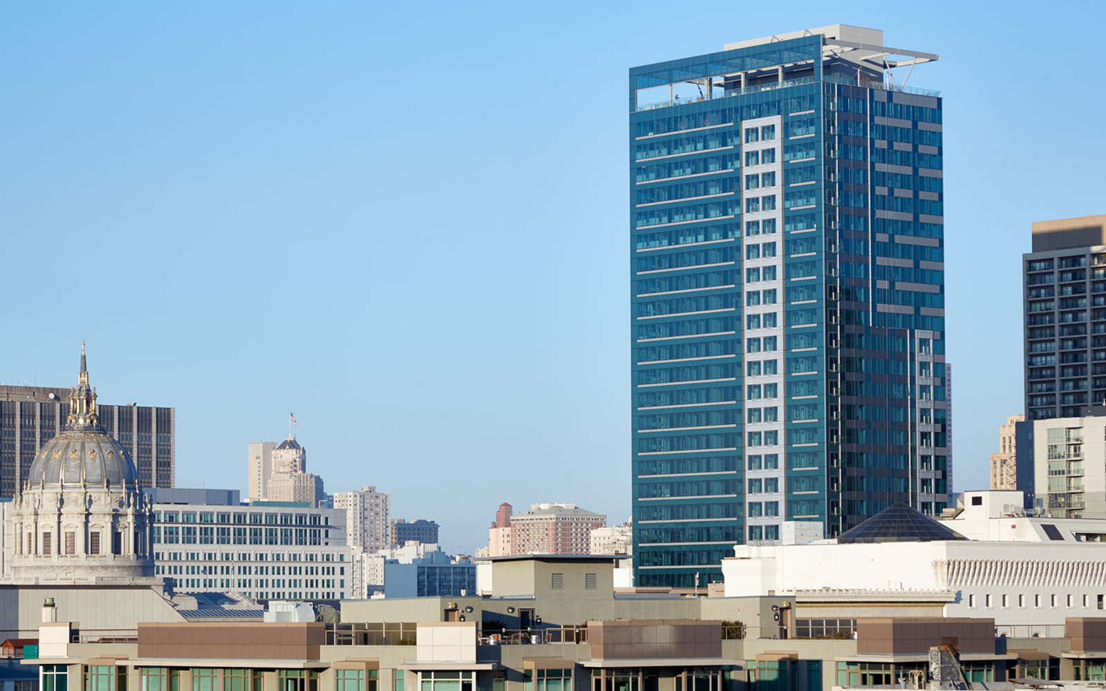
Bloszies is all for office-to-residential conversions, but said this one missed the mark. The 1974 office tower near Civic Center, which formerly housed the California State Automobile Association, was converted to over 400 apartments with a design by Solomon Cordwell and Buenz in 2015.
“The new façade and especially the forms at the top are not much of an improvement to the skyline near City Hall,” Bloszies said.
Andy Rastetter PE and LEED AP, Associate at Buro Happold
Rastetter is both an architect and a structural engineer in the Oakland office of London-based Buro Happold and has worked on designing the seismic system at the Academy Museum of Motion Pictures in LA, among other projects.
Favorites
De Young Museum
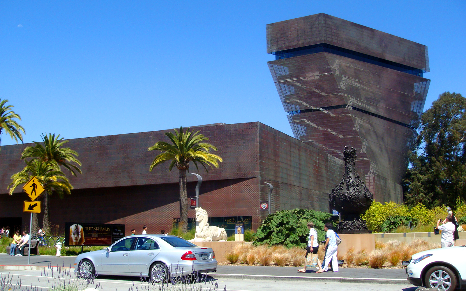
Rastetter chose Herzog & De Meuron’s 2005 rebuild of the De Young Museum for its “natural extension” of surrounding Golden Gate Park, which he prefers to the Academy of Sciences’ 2008 rebuild across the concourse. He also appreciates how the De Young provides a “great backdrop to art” that has a strong presence without overwhelming the works inside.
Chapel of Chimes
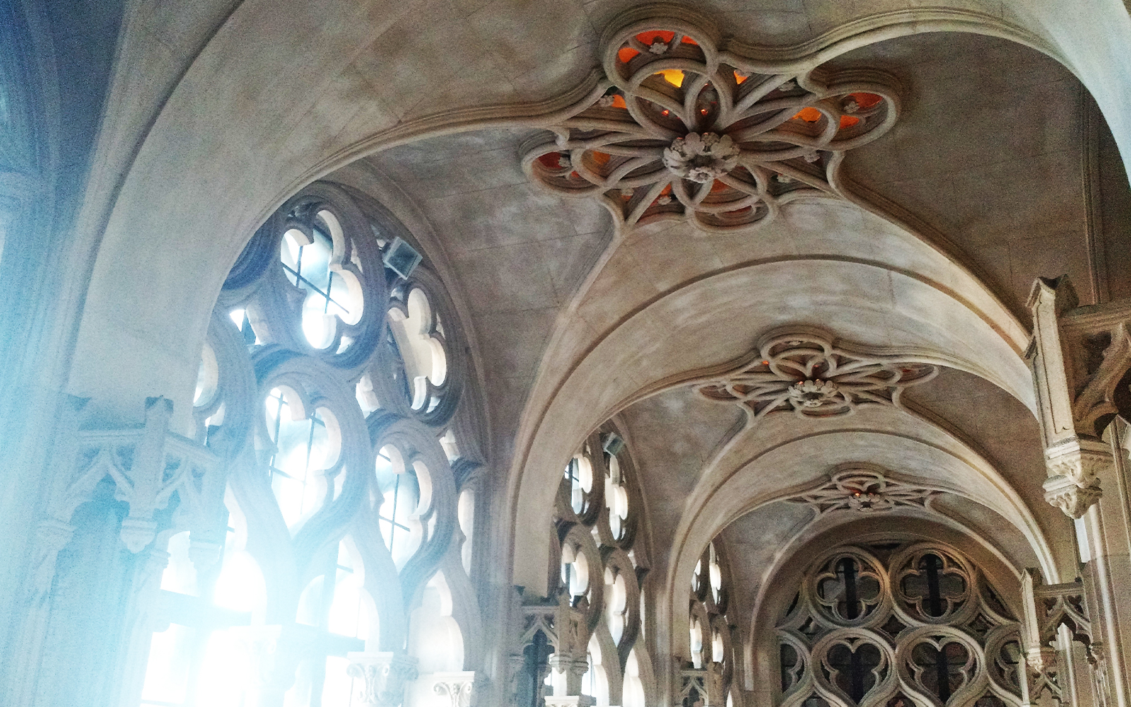
Rastetter pointed out the “incredibly ornate interiors” of Julia Morgan’s 1928 redesign of this Oakland building, which has been used as a funeral home since the 1980s. He called the chapel “possibly the best kept architectural secret in the Bay Area, considering that it is freely open to the public seven days a week” as well as “some of the most ethereal interior environments I have ever come across.”
Salesforce Park
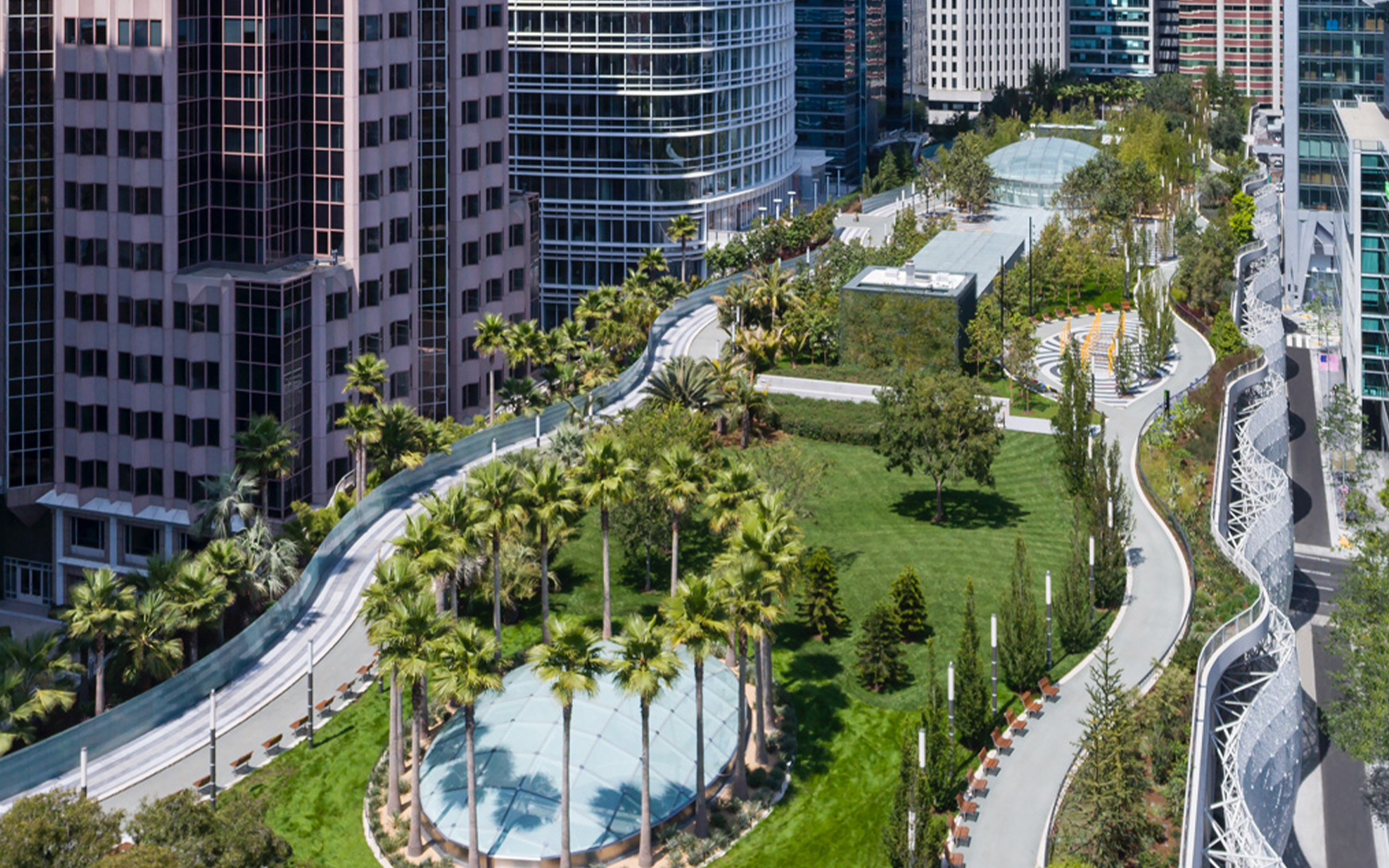
Rastetter raved about the Pelli Clarke Pelli design of Salesforce Park, which he called “one of the best urban spaces in San Francisco.” The four-block-long elevated park above the Transbay Terminal opened in 2018, then closed almost immediately afterwards when cracks were found in two steel beams, then opened again in summer 2019. The company’s neighboring namesake 61-story tower itself is “nothing special,” which put it on the top of his least favorite lists.
Read more


Least Favorite
Salesforce Tower
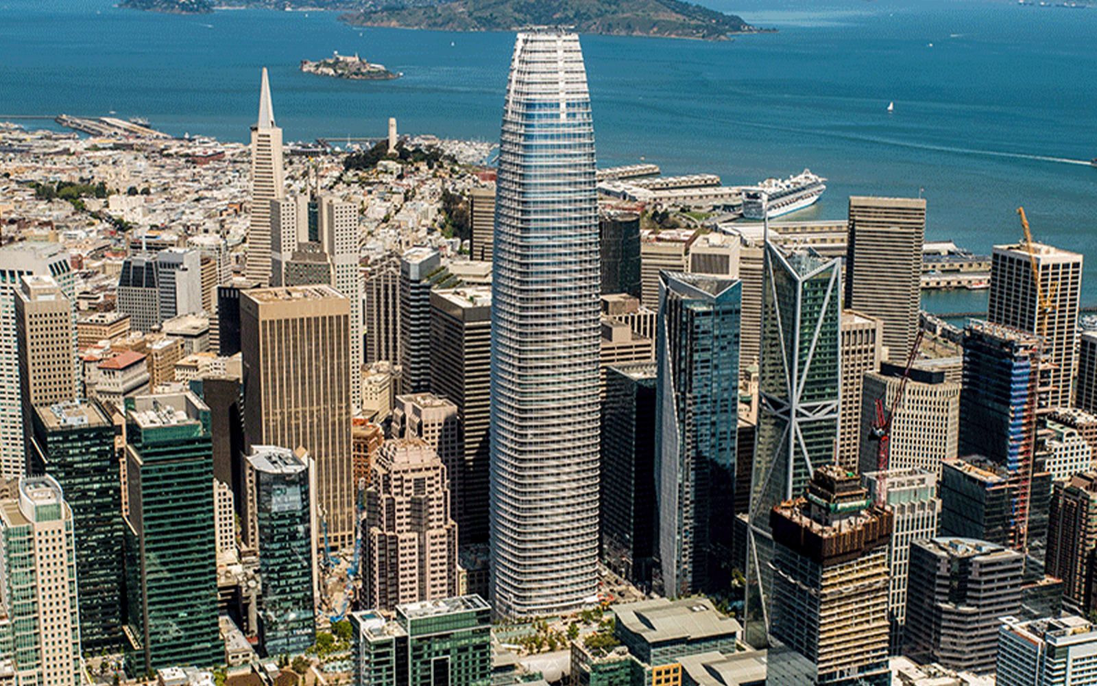
Also designed by Pelli Clarke Pelli and the last of Cesar Pelli’s designs to be completed during his lifetime, Salesforce Tower got a thumbs down from Rastetter.
“The tower that defines the San Francisco skyline should not be so ordinary, mundane or phallic,” he said. “This was a missed opportunity to do something great.”
Neiman Marcus Department Store
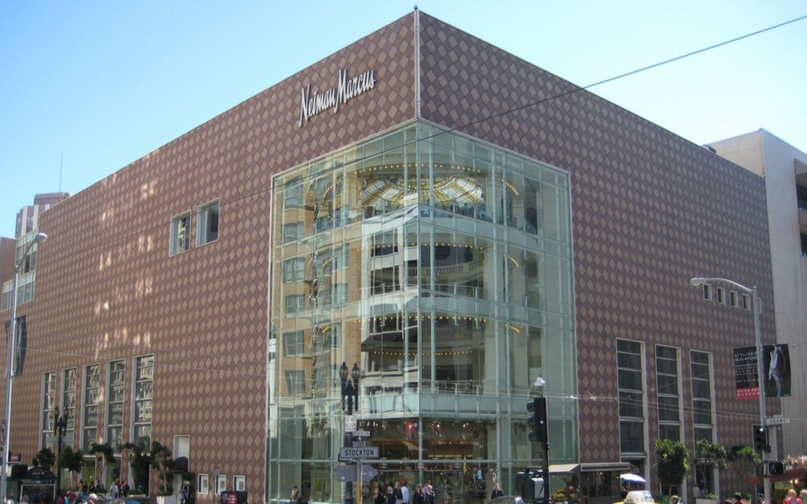
Rastetter called this Johnson/Burgee design from the early ‘80s “probably Johnson’s worst project, there is almost nothing I like about this building.” Its only redeeming feature is the original turn-of-the-century City of Paris atrium, he said, which was saved by preservationists when Neiman Marcus bought the Beaux Arts building in the 1970s with plans to demolish it.
“It feels like the atrium is held captive behind the poorly detailed post-modern façade,” he said.
Vaillancourt Fountain
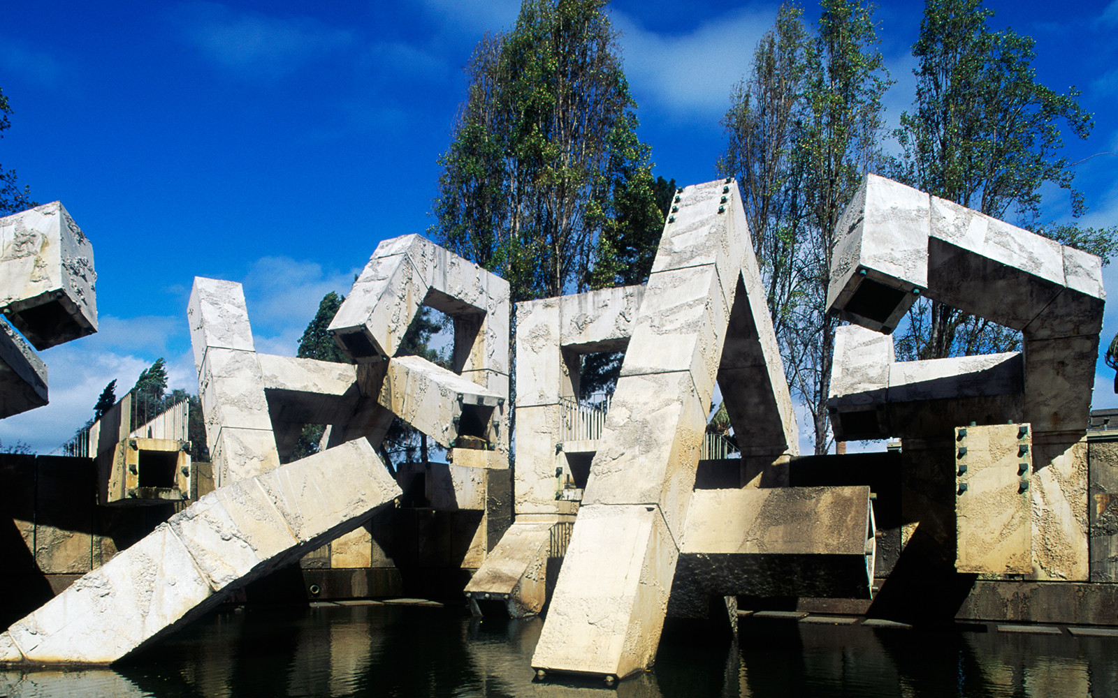
Rastetter concedes that the early 1970s fountain by Canadian artist Armand Vaillancourt in Embarcadero Plaza is not a building, but the precast concrete square tubes make the 40-foot-high structure “very architectural in its size and proportions.”
“This sculpture literally makes the plaza look worse,” he said. “But these days you could argue that it blends in nicely with the adjacent homeless camps!”
