TRD Friday Feature:Architects don’t create pictures, they create buildings. But this technicality isn’t going to stop a media maelstrom from erupting every time a batch of renderings for a major project gets released. The fact that the renderings will likely get more attention than the completed building is in their nature — unlike a building, they come out of nowhere, and also unlike a building, they’re designed to do little else but look marvelous.
On the one hand, photorealistic renderings are the great equalizer. “Reading a rendering is like reading Instagram. Anybody can do it, and that accessibility is a great tool that we have to communicate what we’re working on to the public,” said Marc Kushner, cofounder of architecture firm HWKN.
But like an Instagram post, a rendering is a heavily manipulated image of questionable authenticity, and those less experienced with making them — namely, non-architects — are more susceptible to their high-contrast charms. “It would do the public some good to be always a little skeptical of a rendering… maybe squint their eyes and imagine a rainy day, or question whether the entire promise of the architecture is going to be delivered,” Kushner said.
The issue of realism in architectural representation is a dilemma that has plagued architects since the Renaissance, according to FXFOWLE partner Dan Kaplan. Even today, the jury is out on whether buildings should be represented in their idealized state, or in a more “realistic” fashion, he said.
Below, architects help guide laymen through some common rendering techniques and shortcomings, lest we be blinded by the warm and inviting light of suspiciously transparent buildings.
GLASS
Glassy buildings are particularly susceptible to misinterpretation, experts said.
“When a building has a lot of glass there’s a lot of range as to how that glass can be rendered and that certainly can affect the accuracy of what the depiction looks like,” said Morris Adjmi, founder of Morris Adjmi Architects. “There’s a lot more glass on buildings now. How transparent the glass is rendered and the reflections can make a big difference.”
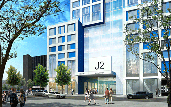
Rendering of Journal Squared in Jersey City (credit: HWKN)
FXFOWLE’s Kaplan agreed, saying that “glass is the trickiest thing because it’s chameleon-like and sometimes it can be very dark and black and other times it can reflect the sky. I think there is the greatest manipulation of glass in general.”
Ken Hudes, principal of Atelier New York Architecture, pointed out that if one looks at a building during the daytime, the windows are all black.
“You don’t see into a building typically in the daytime,” he said, “but in a rendering you want to show some transparency, so that’s not exactly realistic.”
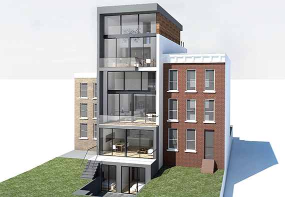
Rendering of 97 Douglass Street in Carroll Gardens (credit: Atelier New York Architecture)
DUSK
Many architects favor the twilight hour in their renderings because it is the one time of day that it may be feasible to see the inside and the outside of a building simultaneously, creating an appealing dynamism.
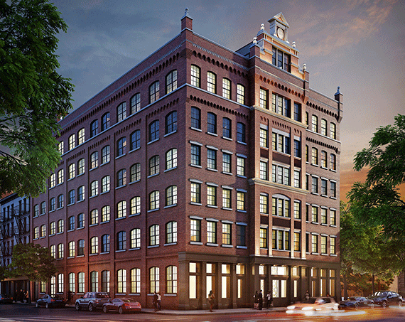
Rendering of 36 Bleeker Street in Noho (credit: Morris Adjmi Architects)
“There was a period of time when almost every rendering was shown at dusk,” Kaplan said, “because you get both the reflectivity of the glass and the reflection of the warmth of a glowing sky. It’s a way to get some warmth into glass buildings, he said, “but at the same time at dusk you turn the lights on so you can see into the building.”
GOD VIEWS
Views from way up above are an effective way to show a building in its environment amongst the landscaping, but don’t necessarily communicate the human experience of a building, according to Hudes, who used to sneak into nearby towers to take photos of his sites.
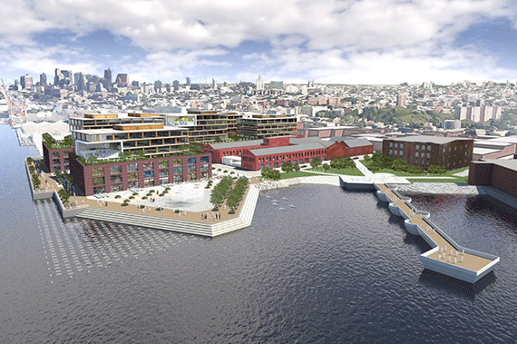
Rendering of Red Hook Innovation Studios (credit: NBBJ)
“We’re not god and we’re not birds,” Kushner said. “You can ask yourself: ‘is this a view I will ever see as a citizen of a city?’ If it’s not, maybe that’s not really the way to ingest a project.”
A sub-category of this is the hovering view, which is an angle from three to five feet outside of a building looking in. “There’s a beautiful [rendering] of 35XV that shows the sloped facade which is a very hard thing to convey in two dimensions,” said Kaplan, who designed the building for Ken Horn’s Alchemy Properties. “It shows what the experience would be from inside and at the same time shows the look or impression from the outside,” said Kaplan. He also noted that this view is, in real life, reserved for birds.
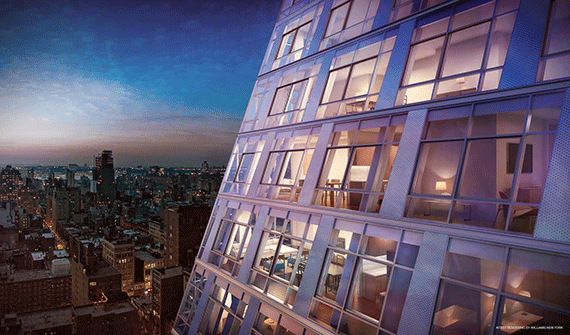
Rendering of 35XV at 35 West 15th Street in Flatiron (credit: FXFOWLE, Alchemy Properties and Williams NY)
GREEN-WASHING
According to Kushner, there was a trend that has “passed a little bit” where entire New York City building facades were inexplicably covered in “growy green things.”
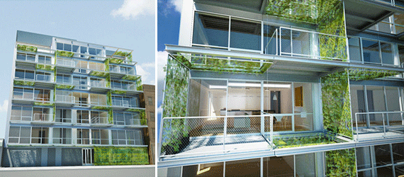
305 Union Avenue in Williamsburg (credit: Garrison Architects)
“Think Brazil. Like, we’re in Rio,” he said. As for how this verdance would materialize, Kushner is skeptical. “It’s going to be covered by greenery — somehow. It doesn’t necessarily need to be explained how. That’s the thing thing about renderings. You’re looking at the final effect rather than how.”
PEOPLE
When people become part of a rendered landscape, it opens up a whole can of politically incorrect worms. While most architects want the avatars to look happy, healthy, and attractive, it becomes difficult when you consider specific questions of bodily proportion or race.
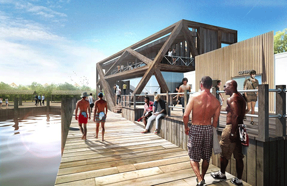
Rendering of Fire Island Pavilion (credit: HWKN)
“You want to make sure that it looks like a New York street and that it’s got the diversity of a New York street,” Kaplan said.
Hudes was more direct. “We try to keep it multicultural.. there are all different colored people in there,” he said.
Hudes believes that placing people in a rendering can make all the difference in the world, and half-jokingly credited the strategic placement of a grandfather holding his granddaughter’s hand for his firm winning a 9/11 memorial design competition in Huntington. “I wouldn’t be surprised if that’s how we won,” he said.
Kushner noted that placing people in a rendering is a way to show a building durings its best moments, like during celebrations, which can create an “element of drama.”
Digital people also present an irresistible opportunity for winking inside jokes. According to Kaplan, there was a stretch of time when it was common to see a tiny likeness of Amanda Burden, the glamorous former director of the City Planning Commission, rendered inconspicuously amongst the crowd.
HEAD-ON VIEWS AND VIGNETTES
Straight-on views of a building, known as “elevational” angles, are experiencing a resurgence, especially for facades that have a lot of detail to show off.
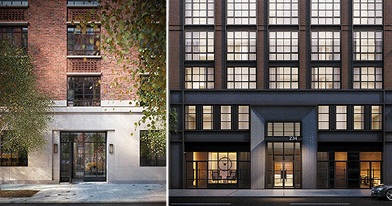
From left: Renderings of 140 West 12th Street (credit: FXFOWLE) And 234 East 23rd Street (credit: Goldstein Hill & West Architects)
“In a way, it’s a fair representation of the building because you’re not pretending that it’s going to look like this at a certain point from the sidewalk,” Kaplan said.
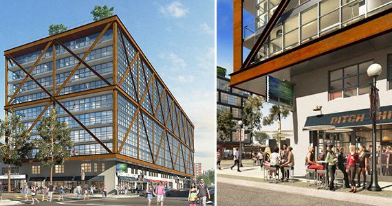
Rendering of Atlantic Plumbing in Washington, D.C. (credit: Morris Adjmi Architects)
Adjmi enjoys vignetted, close-up renderings that showcase details like entries, canopies, lighting, or places where two different materials meet.
STORYBOOK WEATHER
While conventional wisdom is to show a building on a sunny day, even snow can be used to create an artful and inviting image. For an FXFOWLE-designed building in Montreal, the firm went this route. However, the building did not make it past the design phase.
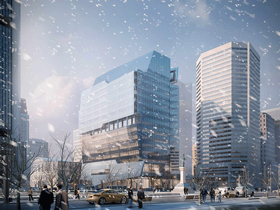
Rendering of Place de la Cité Internationale in Montreal (credit: FXFOWLE)
“It was atmospheric,” he said. “It would be June but we’d say, ‘Nah, let’s show it snowing!’ We’d laugh every time… It was well-rendered snow.”
