TRD Friday Feature:When DDG launched a teaser site for its Soho chocolate factory-turned-condo building XOCO 325 featuring artwork by DC Comics illustrator Shawn Martinbrough, the developer epitomized so many absurd real estate marketing trends that it inspired this look back at some of our favorites.
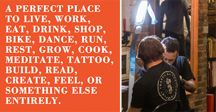
Forget simply touting their buildings as lifestyle vehicles. Developers are now assaulting buyers and renters with all-out fantasyland fictions, encouraging them to see themselves as literary characters and forever assuring them that their creative potential will be unleashed — particularly in tattoo form.
Below, find several masterpieces of subliminal and not-so-subliminal messaging.
XOCO 325 – DDG Development

Xoco 325
In naming this condo conversion, DDG opted for the obligatory past-use reference (see: the ex-steel factory Lewis Steel Building, ex-grocery warehouse Austin Nichols House, and Castlebraid, built on the site of a trimmings factory). In this case, you’ll need a Catalan-English dictionary (xoco = chocolate) to pick up on the tribute to a Tootsie Roll factory once on the site.
DDG is publishing an entire comic book of Martinborough’s illustrations as part of its marketing effort. The imagery seems to align building dwellers with the adventurous protagonists, and attributes to them a geek-chic taste for animation. Perhaps studies showed the popularity of graphic novels among well-heeled buyers?
The Schumacher – Stillman Development International
The Schumacher will go down in history as the building whose essence was so enigmatic it required a professional poet to convey it. And Howard Altmann picked up on the nostalgic themes most desirable to apartment hunters with admirable efficiency. “Once/ 36 Bleecker was one of the finest print shops in/ New York City.”
We’re sold, Altmann.
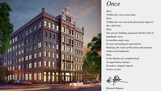
A rendering of the Schumacher and poem by Howard Altmann
15 Renwick Street – IGI-USA (a subsidiary of Izaki Group Investments), Glacier Global
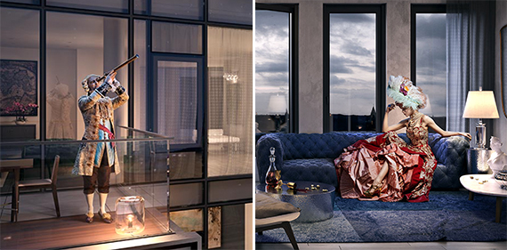
Setting the gold standard for bonkers advertising campaigns, IGI-USA employed a host of steampunk-themed models dressed in everything from Victorian-era corsets to “Cinderella Man”-inspired boxing gloves and trunks, photographed them playing Backgammon, and said, “To hell with it. Does this make Hudson Square appealing?”
As far as misleading renderings go, this project is off-the-charts. Which of these objects is not like the rest? Hint: the one that you’re buying.
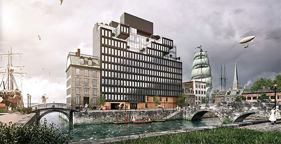
A rendering of 15 Renwick Street
To the developers’ credit, they’ve now sold out the bulk of the building’s units, including an $8.2 million penthouse.
The Boerum – Flank
While there’s nothing quite so flagrant to set apart The Boerum, its official site features a nice cross-section of trends we’ve seen cropping up, including selectively replacing renderings with sketches (a whimsical invitation to join the storybook fun), and highlighting the best of the neighborhood’s attractions as if they were building amenities in order to conjure a setting for the resident-character.

The Boerum
Forget the $3 million price tag, just relax and “drift” to “one of the best baguettes in America.” Or, take a 10 minute walk to where Walt Whitman’s “Leaves of Grass” was first published, the website states.
1133 Manhattan Avenue – Domain Companies
The residents of this Greenpoint rental building need tattoos like they need air.
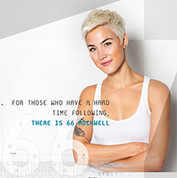
66 Rockwell Place – Dermot Company
At 66 Rockwell Place, tattoos mark you as the type who goes against the flow (along with your 325 neighbors). Perks include in-house programming by the Brooklyn Academy of Music and BRIC to keep fueling your creative fire, hopefully inspiring more tattoos.
1N4TH – Douglaston Development
For its massive 510-unit rental building on the Williamsburg waterfront, Douglaston Development has gone all-in on its advertising, repeating an image of a stoic girl with fuschia tresses. We like to think of her less literally than as a “through the looking glass” reflection of your spirit, creatively awakened as it will be once you settle in your new pad.
280 Metropolitan Avenue – CB Developers, SK Development
The developers of 280 Metropolitan don’t even need the backdrop of the building to achieve their desired effect. Many images on the official website are object arrangements — storyboards, if you will. The modern hipster shares in common with the steampunks of 15 Renwick a taste for whiskey and brass telescopes, but has developed a penchant for health, as evidenced by Whole Foods paraphernalia and kale. The only discordant note is the Superbowl tickets- who brought those?
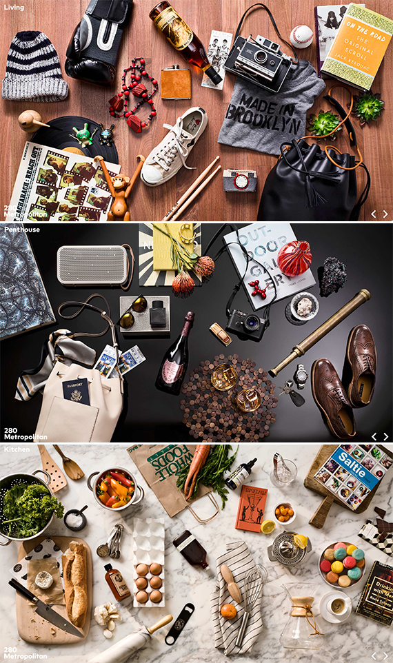
280 Metropolitan Avenue

