A hazard of the profession for New York architects is the unsolicited takes on the city’s design duds.
“People always say the white brick buildings,” said Jonathan Marvel, founder of Marvel, referring to the apartment towers that dot the Upper East Side.
But for the principals reshaping New York’s skyline, ranking buildings is much like choosing a favorite child.
“I would love to just say that it is hard to find a really ugly building in New York City,” Marvel added.
Rather, the architects The Real Deal spoke with whittled down their top picks and misses in terms of how each building fit with its surroundings. Favorites fostered connection between the city and its people or added beauty, and the unsung detracted from that harmony.
“We as architects are essentially inserting ourselves into a fabric that has been woven over centuries,” said Paul Taylor, founding partner of Stonehill Taylor.
Here are their rankings:
Chris Fogarty, co-founding principal of Fogarty Finger Architecture
Favorites
- Butterfield House, 37 West 12th Street
Butterfield House is a modernist co-op on a West Village block of 19th-century brownstones. Fogarty loved the building so much, he moved there.
“I’d been looking at it for years,” the architect said, noting the building’s striking bay windows and its ability to mesh with its surroundings.
When Butterfield House received its landmarks designation in the late ’60s, the city celebrated the building as an example of a new building that harmonized with the old.
“It really tries to be a good neighbor,” Fogarty said.
- University Village’s ‘Silver Towers,’ 100 and 110 Bleecker Street, 505 LaGuardia Place
A slum clearance initiative in the early ‘50s leveled three city blocks in Greenwich Village. That space gave way to three 30-story brutalist towers designed for NYU in the early ’60s.
“They’re sort of something that doesn’t normally work well — what is called a tower in a park,” Fogarty said, referencing the form pioneered by Le Corbusier, a founder of modern architecture.
The design was dreamed up as an answer to overcrowding; in practice it isolated residents from the rest of the city.
“You wouldn’t want the whole city built that way,” he added. “But those buildings are so beautiful and a really interesting way of thinking about how you live.”
- Pepsi Cola Building, 500 Park Avenue
Pepsi-Cola’s headquarters throughout the ’60s, the office tower features a curtain wall of glass and aluminum, a novelty in Midtown, at the time.
“It was built when Park Avenue was entirely brick office buildings, so it must have just been a little gem,” Fogarty said.
Least Favorites
- One High Line, 76 Eleventh Avenue
“I hate any building that twists for the sake of it,” Fogarty said of the two BIG-designed towers.
To Fogarty, architecture should be logical. Bathrooms stack on top of bathrooms to prevent leak, for example.
A twisting building complicates a layout, unnecessarily, the architect said.
“I would get it if it were really beautiful,” Fogarty said. “But it just seems to be a bit of a one-liner.”
- Public storage buildings, anywhere
“Whether it’s in Brooklyn, by the BQE or in Vermont by the side of a little-winding road where they put a corrugated metal shed, I dislike any public storage building,” Fogarty said.
For the architect, public storage symbolizes a culture of excess.
“We buy so much crap that we then spend money to store and we don’t need it, ever,” he said.

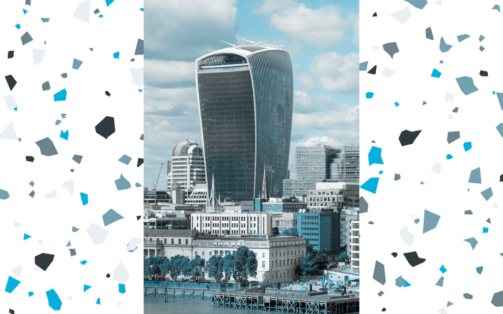
- The Walkie-Talkie, 20 Fenchurch Street, London
Fogarty hails from the U.K., so The Real Deal allotted him an across-the-pond diss.
The architect’s “passionate dislike” for the London office tower stems from perspective. When pedestrians look up at a skyscraper, they expect it to disappear into the sky, Fogarty said.
“The Walkie-Talkie does the opposite,” Fogarty said. “I look at it and I feel physically nauseous.”
Jonathan Marvel, founding principal of Marvel
Favorites
- Ford Foundation Building, 320 E 43rd Street
Marvel had originally chosen a different first favorite: The Chrysler Building.
“It’s so meaningful, but we all share it, so how can you claim the Chrysler building?” Marvel said.
His replacement: The Ford Foundation Building in Midtown East, a bronze and gold office tower commissioned by Henry Ford in the early ’60s. The building’s highlight is a seven-story atrium that doubles as a conservatory, overflowing with vegetation.
“It’s such a statement about the environment and sustainability from before that was an issue,” he said.
- Grand Central Terminal, 89 E 42nd Street
A guiding principle of Marvel’s favorite picks are buildings that “engage the public at the ground floor.”
“Grand Central Terminal with that crazy vaulted ceiling of the Zodiac — everybody can find themselves in the ceiling,” Marvel said, touching on the awe-inspiring sensation of looking up in Grand Central.
“It feels like a celebration,” Marvel said. “Public transportation being so emblematic of what a city needs, what better portal to celebrate it than Grand Central Terminal.”

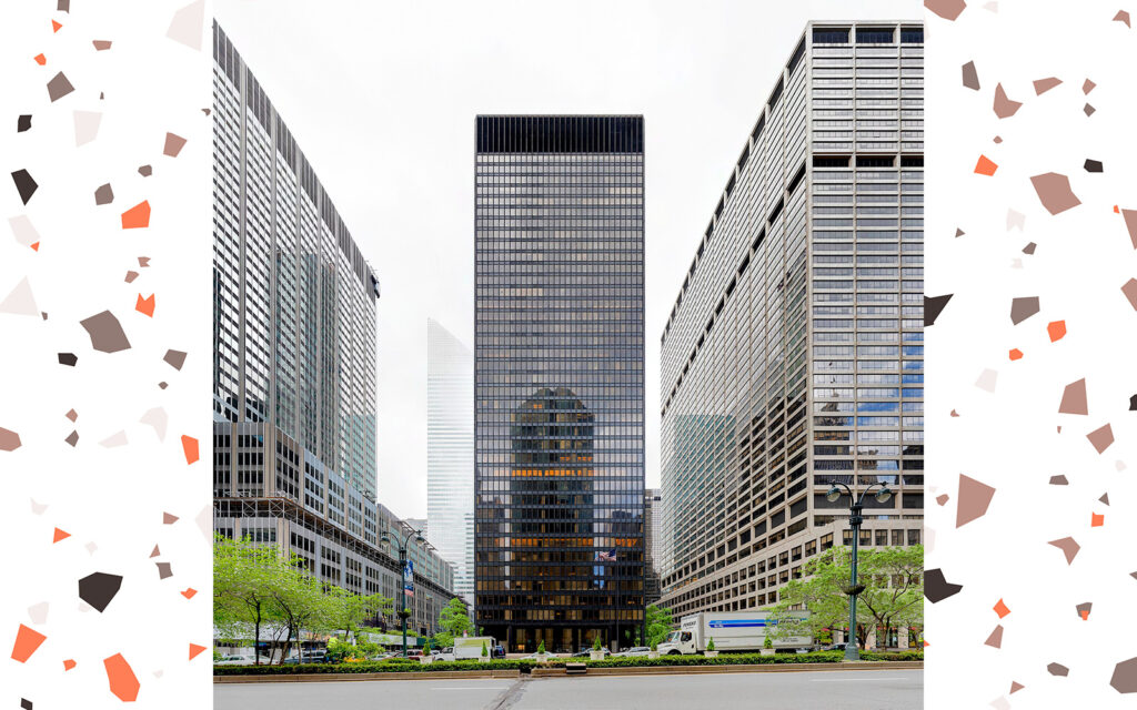
- The Seagram Building, 375 Park Avenue
To enter the minimalist office tower on Park Avenue, visitors pass through an open plaza with fountains flanked by marble slabs, an invitation for the public to take a seat.
Apart from that public engagement, the Seagram Building holds nostalgic value for Marvel. A gig at the building’s former Four Seasons restaurant was the architect’s first job in New York.
“I would escort people from the grill room down that gorgeous hallway to the dining room where all these amazing people were sitting in this amazing space,” he said. “You felt like, ‘Wow, this is New York City.’”
Least Favorites
- Trump Tower, 721-725 Fifth Avenue
Not only is the jagged facade of the Trump Organization headquarters “unfriendly and ugly to look at,” Marvel said it doesn’t give anything back to the city. Rather, it diminishes its surroundings.
“It takes all the oxygen out of the room when you walk by it,” he said. “It looks evil.”
- Lenox Health Greenwich Village, previously the National Maritime Union headquarters, 30 7th Avenue
For Marvel, the former headquarters of the National Maritime Union is a missed opportunity.
The building’s design mimics an ocean liner with porthole-like windows cloaked by scalloped cusps.
“If you’re going to call attention to yourself through an ornamental detail, you’ve got to do it in a way that makes the ornament part of the building,” Marvel said.
On 30 7th Avenue, the cutouts are awkward. “They’re working against the building,” he said.
- Glass office “boxes”, along Park Avenue South
Marvel can’t pinpoint the addresses of the glaring “glass boxes” that break up the older brick buildings along Park Avenue South. But that’s the point.
“It’s a generic building,” he said. “You see a glass box up against a beautiful old detailed brick building and it’s hateful because it gives nothing back.”
Marvel concedes if the building featured beautiful glass, its reflectivity might offer something to passerbys.
“But it’s not such nice glass,” he said. “It’s a copycat modern building of the ’70s and ’80s.
Paul Taylor, founding partner of Stonehill Taylor
Favorites

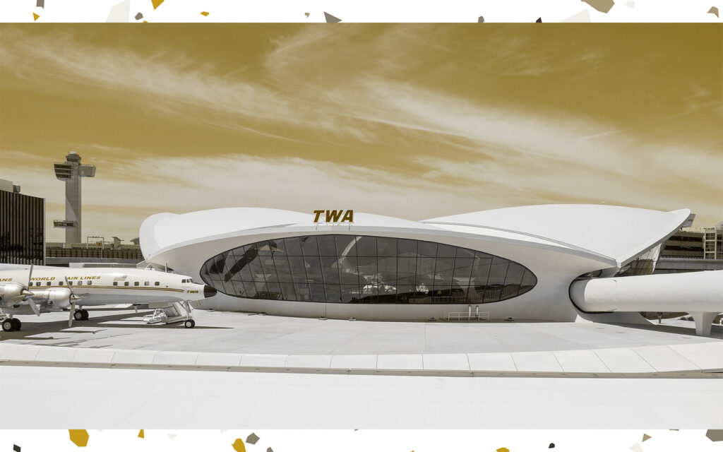
- TWA Hotel, John F. Kennedy International Airport, One, JFK Access Road
Taylor’s best of New York centered on buildings that showcase the city’s ability to evolve.
“The thing that makes the city rich is the fact that we have adaptive reuse,” he said.
TWA Hotel, the recent redesign of Howard Hughes’ Trans World Airlines terminal, exemplifies how New York celebrates its history by repurposing it.
“That couldn’t have occurred in a smaller city because the building wouldn’t be there to be transformed,” he said.
- Rockefeller Center, 45 Rockefeller Plaza
When Rockefeller Center opened in the 1930s, architecture critics panned it as “reckless, romantic chaos.”
Fast forward just shy of a century, and the building is a cultural hub, a tourist attraction and an icon of the holiday season.
“It’s more than a building,” said Taylor, who loves the Rock for acting as “a neighborhood unto itself.”
“And the architecture, for some reason, isn’t glaringly off putting so many years later,” he said.
- One World Trade Center, 285 Fulton Street
Typically, Taylor balks at buildings that stick out from the surrounding skyline.
But One World Trade and the 9/11 Memorial & Museum, he views as not just a structure but a sculpture.
“It ended up as more than it was before it was destroyed,” Taylor said, noting the draw for millions each year.
“The main part of the likes, for me, is that the buildings contribute to everyone’s enjoyment of a neighborhood,” he added.
Least Favorites
- Central Park Tower, 225 West 57th Street
If One World Trade sets itself apart in the right way, Central Park Tower does it wrong.
“I dislike new insertions into the historic fabric that don’t improve on it and in fact subtract from it,” Taylor said.
The architect who lives on Central Park West has personal beef with the needle towers that line Billionaire’s Row. They ruin his view.
“I look over the park and it looks like an invasive weed in the lawn of New York City,” Taylor said.
- Moynihan Train Hall at Penn Station, 351 West 31st Street
TWA Hotel made an old building cool again; the Moynihan Train Hall wasted the Beaux-Arts Farley Post Office, Taylor said.
“They built a suburban mall on the side of the Farley building,” he said, referring to the redesign of the Amtrak train station.
“You arrive in New York and you have no idea you’re in a historic building whatsoever,” he said.
- Hudson Yards
The problem with Hudson Yards, Taylor said, is it’s essentially single-use.
Apart from office towers, the architect said the mall is “the only thing you can go to when you’re there.”
“You can walk by the Rolex shop, which has nobody in it because you go to Madison Avenue for that,” he added.
And don’t get him started on The Vessel, a sculpture that visitors can climb to gain an alternate view of the neighborhood’s glass towers.
“That is the most moronic, ugly thing,” Taylor said. “What am I going to see up there that I’m not seeing down here?”
Read more

