Frank Gehry’s Walt Disney Concert Hall has made the case for new architecture in Los Angeles, but classic Los Angeles buildings continue to inspire and define the best of Los Angeles, said architects interviewed by The Real Deal. They consistently picked buildings constructed before 1970 as the megalopolis’s best edifices.
Susan O’Connell, a managing principal of AC Martin, said buildings such as Los Angeles City Hall, constructed in 1928, were not afraid of the big statement.
“The buildings were built at a time when Los Angeles was looking forward to what it could be,” O’Connell said. “These buildings were not afraid to celebrate what a city hall was. What a post office was. My God, what a tire store was. There are certain areas of architecture that could celebrate people and community.”
O’Connell, and fellow Los Angeles architects John Lesak of Page & Turnbull and Brian Kite of SRK Architects talked to TRD about their favorite Los Angeles buildings in their own words.
They also weighed in on the city’s eyesores.
Susan O’Connell, managing principal AC Martin
SIGNIFICANT PROJECTS O’CONNELL HAS WORKED ON; San Diego State University
Engineering and Interdisciplinary Sciences Complex
San Diego, California
Favorite Buildings
Union Station 800 N. Alameda, Los Angeles
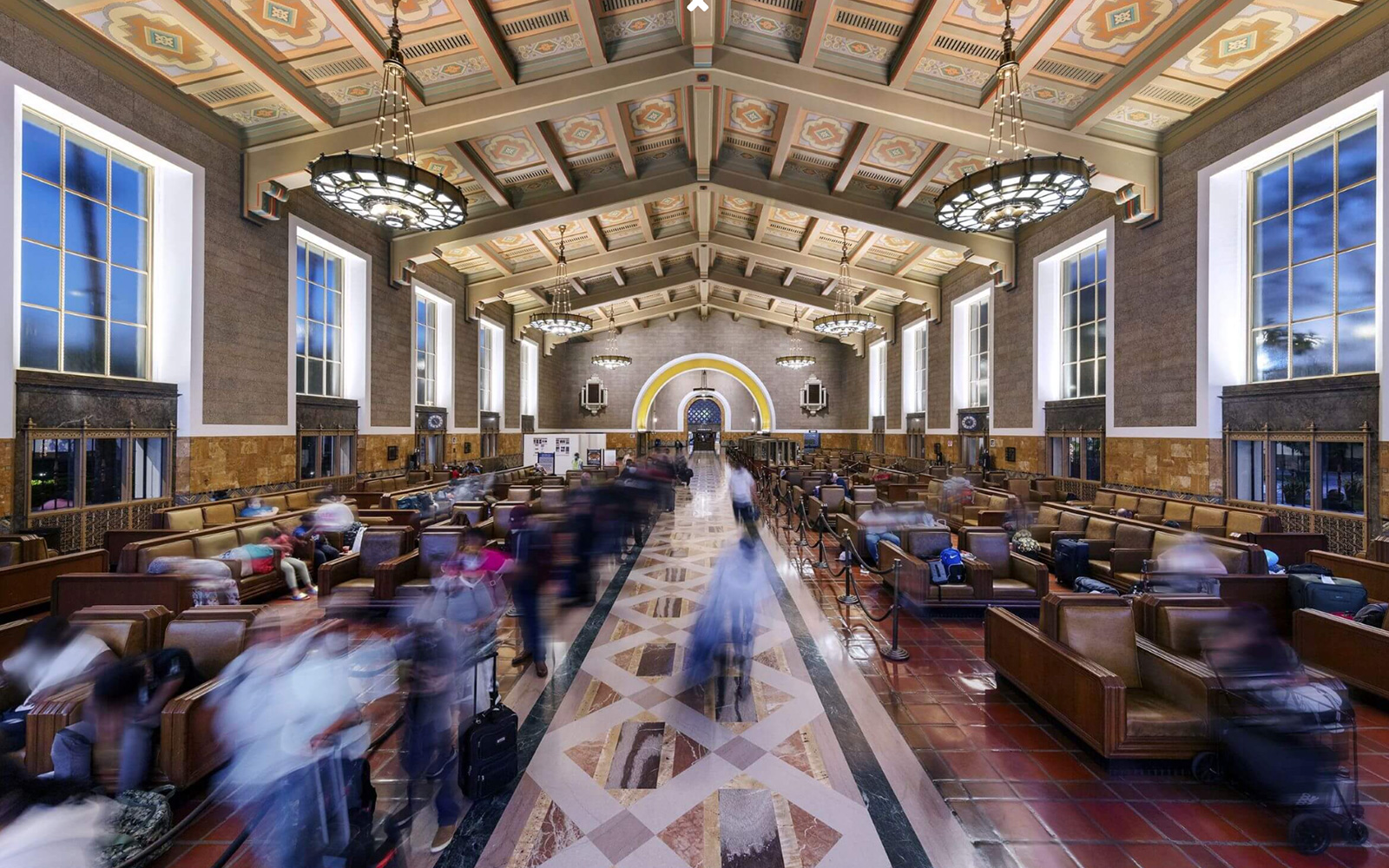
“It is a building that has stood the test of time as an arrival portal and a gathering space for the city. I love its open courtyards where you can wander in and out while you are waiting for a friend to arrive or for your train to depart. People used to dress up for travel and dine in the restaurant before departure. At that time, there was an elegance to travel, which has always attracted me to train stations.
“I also love the way the city has embraced it, taken care of it, and created redevelopment projects around it.”
Pasadena City Hall, 100 Garfield Ave., Pasadena
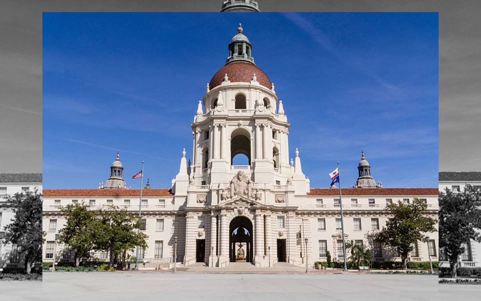
“It’s an amazing Spanish and Mediterranean Revival-style building with courtyards, colonnades, and a big rotunda. It’s an imposing and inviting front door for Pasadena. I keep on talking about buildings that are part of our urban architecture. Buildings that invite people in — I admire that. We have such amazing weather here; we can be outside and celebrate that. But there’s something about a building that cloisters you when you are outside in a courtyard and creates public space. I love spaces that are covered like a portico. It allows you to duck in and cool off when it is hot.”
Los Angeles Department of Water and Power Headquarters / John Ferraro Building, 111 N. Hope Street, Los Angeles
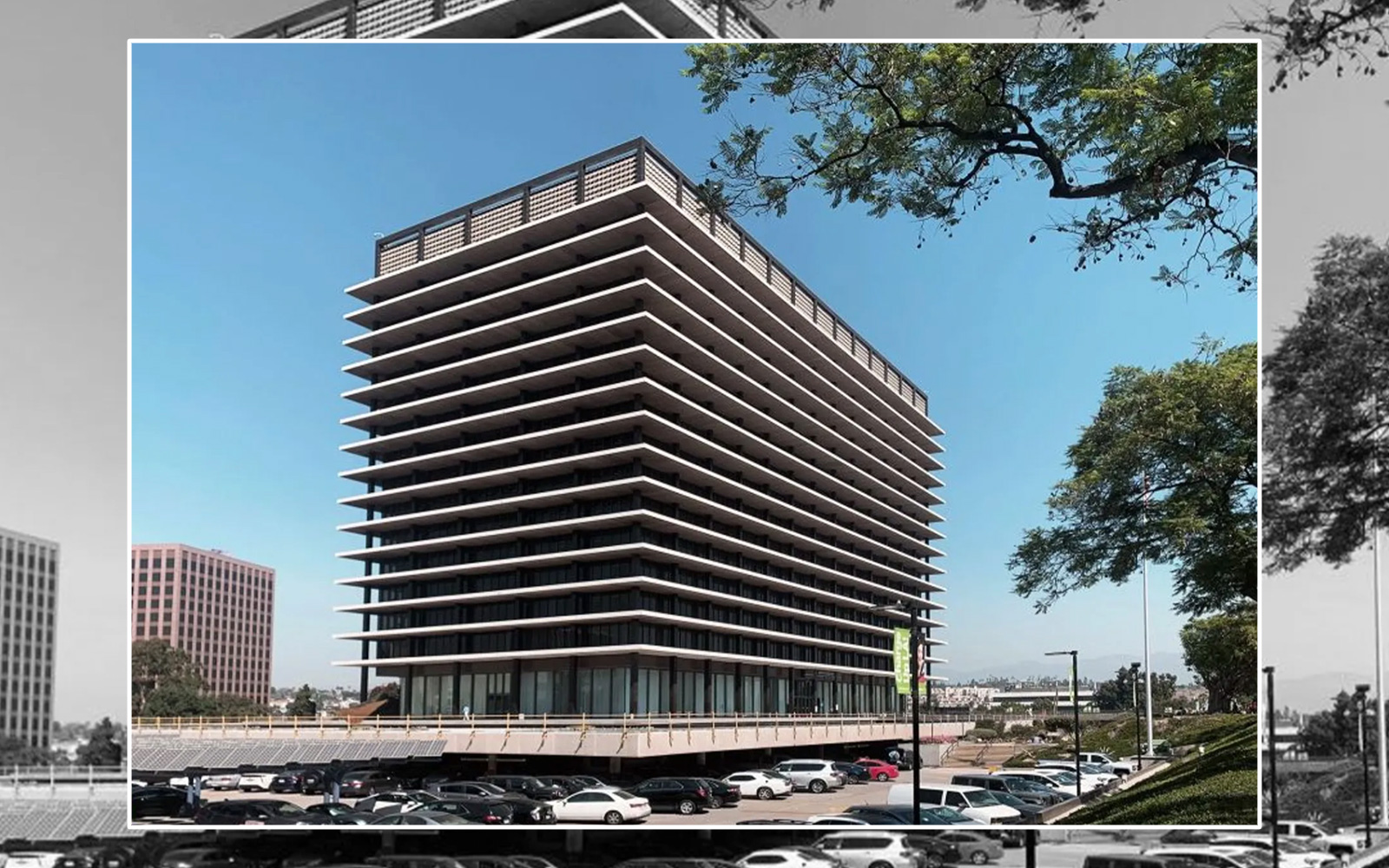
“It is a truly iconic building. The first time I saw this building, I was 17 years old when I came to Los Angeles to submit my application to USC School of Architecture. The moment I saw this building, I knew I was in the right city to study architecture. It’s a giant beacon of light and optimism for the city at night. The International style building’s glass façade glows as it rises from a reflecting pool at its base. During the day the fountains rise up and around the building. It communicates a fascination with bringing water and power to a city bursting with growth and innovation. My 17-year old self had no idea she would be working for the firm that designed it!”
Least Favorite Buildings
Los Angeles Convention Center 1201 S. Figueroa St., Los Angeles
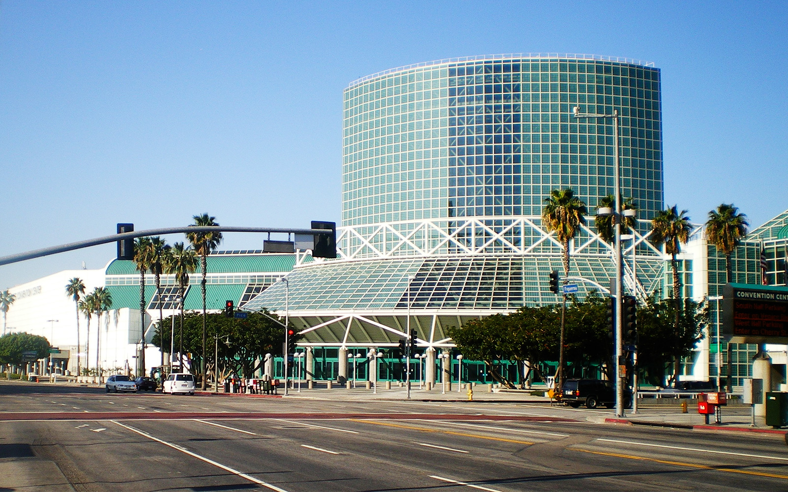
“It is bland, drab and not suited to Los Angeles’ extroverted personality. It doesn’t take advantage of the weather and the climate. It barely connects to the city, let alone celebrate community. It should have been so much more.”
L.A. Live, 800 W. Olympic Blvd, Los Angeles

“It’s the biggest urban error I’ve seen in 20 years in Los Angeles. How often are you able to pull together theater, food, sporting events, and a museum for the same project? How often do you get the opportunity to invite the city in? Walking along the street you don’t see anything that tells you have arrived. It is an urban space that is only alive when people are standing in lines to enter a concert or sports event. There is nothing that draws you into the plaza space. There is no there, there. These older buildings I’m talking about celebrate entry, you know exactly where the front door is and that you have arrived.”
Church of Scientology, 6331 Hollywood Blvd. Los Angeles
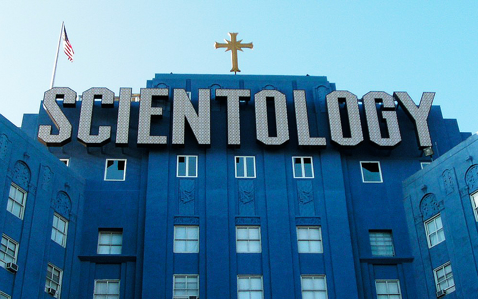
“This building was one of the original Cedars-Sinai hospital buildings, it had a lot of civic gravitas. The building had arms that opened up and welcomed you, almost taking you in to take care of you. Now there’s a big, steel, 10-foot high fence around it and strange little pavilions that were added.
“This is a great example of taking over an older building and doing the exact opposite of what the building was trying to do. The building was open and welcoming to people. Now it seems like it is separated from the neighborhood with a moat. The building’s blue, robin’s egg color doesn’t fit at all with the 1920s stepped streamlined architecture.”
John D Lesak, principal Page & Turnbull
SIGNIFICANT PROJECTS WORKED ON : The Cheech Marin Center for Chicano Art & Culture of the Riverside Art Museum, Riverside, CA
Favorite buildings
Los Angeles City Hall, 200 N. Spring St., Los Angeles
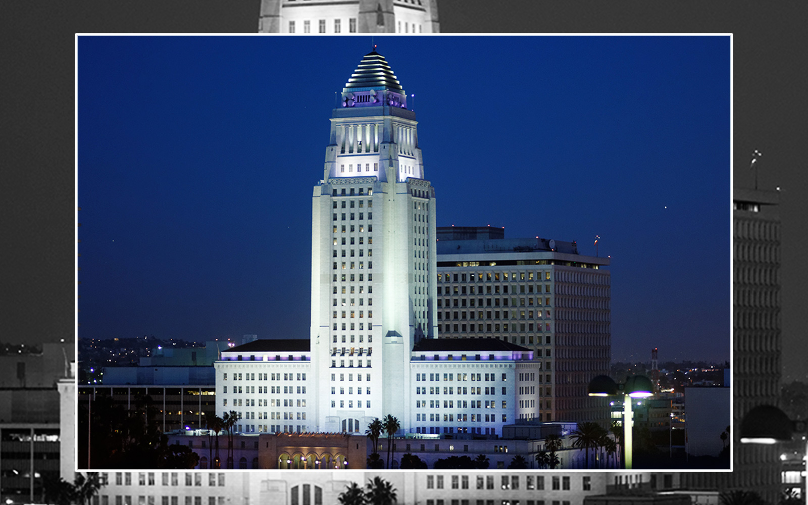
“It was one of my first big projects when I moved to California. a seismic retrofit in the 1990s, and I was involved with its rehabilitation. I think it’s an eclectic style. There’s Spanish Colonial, there’s Byzantine Revival, There’s Art Deco. It’s not pure and clean stylistically. It was designed by a conglomerate of architects. John Parkinson worked on it. AC Martin worked on it. John C. Austin worked on it. I love its rotunda. Going to the 23rd observation deck is one of the great free things to do in LA. It’s such an icon. I grew up in Chicago. I like buildings with big shoulders so to speak. I feel that LA City Hall has the biggest shoulders in Los Angeles.”
Capitol Records Building, 1750 Vine St, Los Angeles
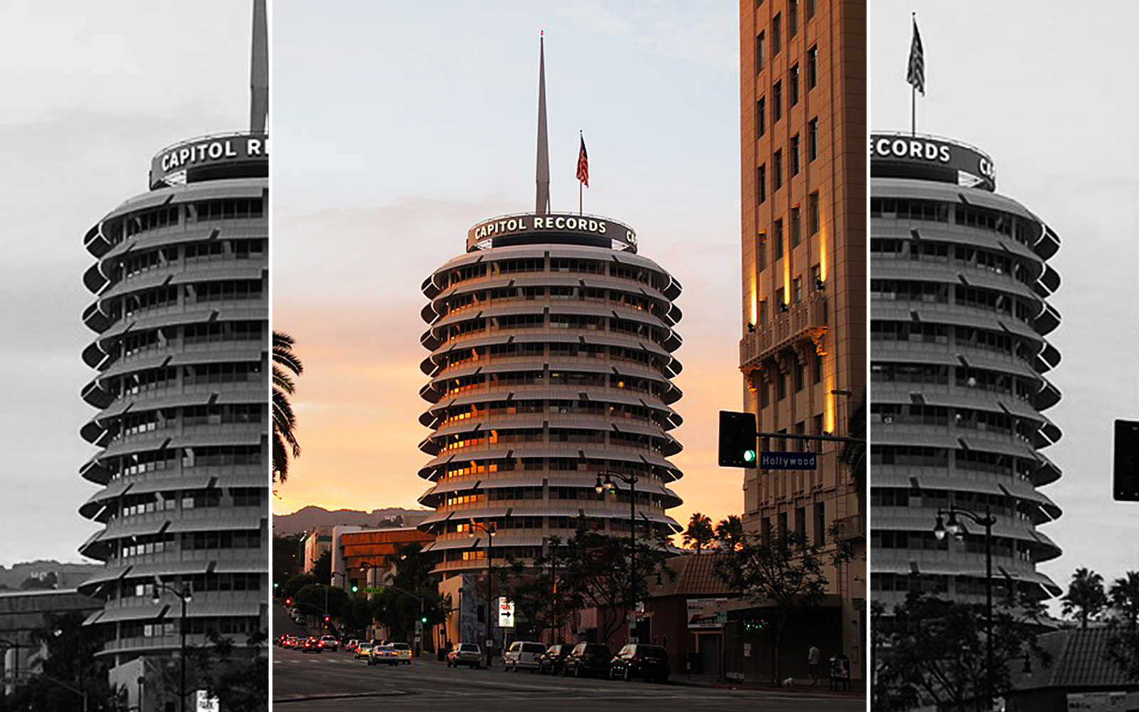
“It was the world’s first round office tower. It was built in 1956. It’s pretty obvious what it is trying to be. But it works well. It’s an office building that centers around the music industry. It looks like a stack of records. It looks great from the street and great when you are sitting inside by a window. It has fabulous views.”
LA County Hall of Records 320 W. Temple St., Los Angeles
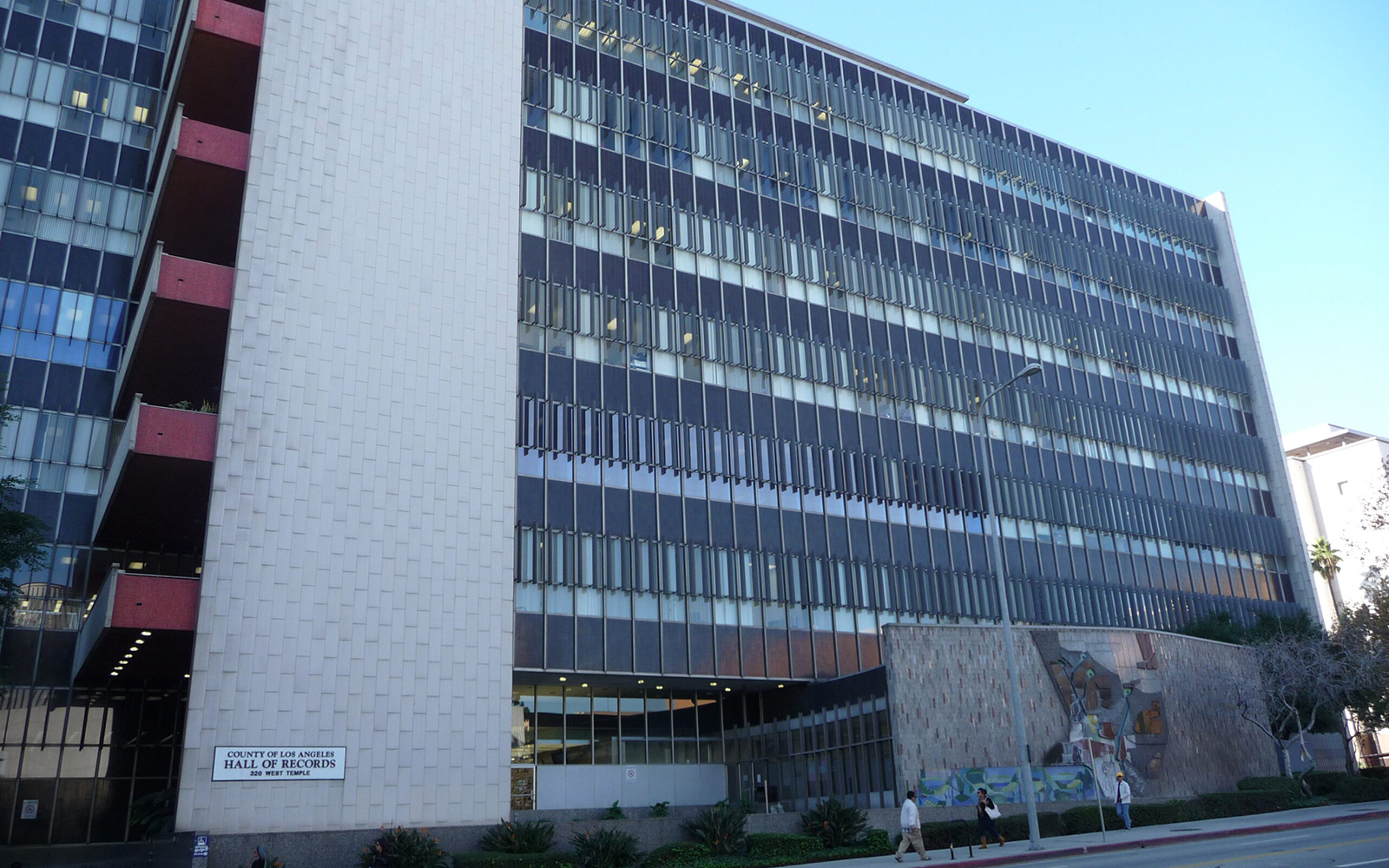
“Richard Neutra designed this building. He is such an interesting guy, He was thinking about sustainable design decades before others were thinking of sustainable design. What impresses me so much about the building is the way it is laid out in relation to the sun. It’s got these big brise soleils that are constructed like airplane wings and shade the southern side of the building, which is all glass. Originally, these giant sunscreens pivoted with the sun to maximize shade. Neutra nailed the depth of the floorplate and height of the windows and ceilings to maximize natural light. In 1920s office buildings, they would lay out floor plans in the shape of an ‘E’, so that sunlight can get all the way into the rooms. As you start looking into the Hall of Records, he laid them the floorplate, windows and ceiling perfectly to get the most natural light. It’s not super obvious at first glance. It took me a year of studying the building to appreciate it.”
Least favorites
Clara Shortridge Foltz Criminal Justice Center, 210 W Temple St., Los Angeles
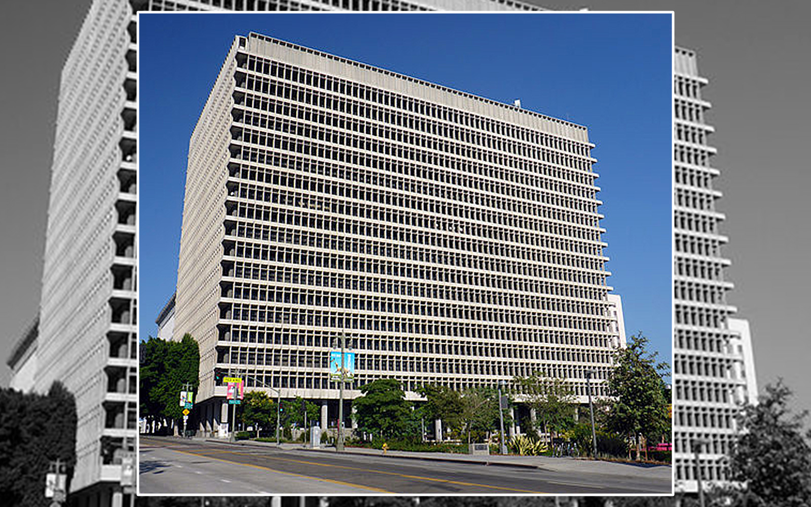
“It’s next to this beautiful beaux arts revival in the Hall of Justice, then suddenly you have this Brutalist block that screws up all of the views, all of the proportions, all of the relationships of the Civic Center; a major public space in LA. It’s also dour on the inside. It’s very bureaucratic. It’s gray and drab and has fluorescent lights. But Brutalism has made a big comeback. Some people are very enamored with it. Plus, while I was working on City Hall, (Clara Shortridge Foltz) was home to ‘Camp OJ.’
“Yuck.”
California Science Center, 700 Exposition Park Dr., Los Angeles
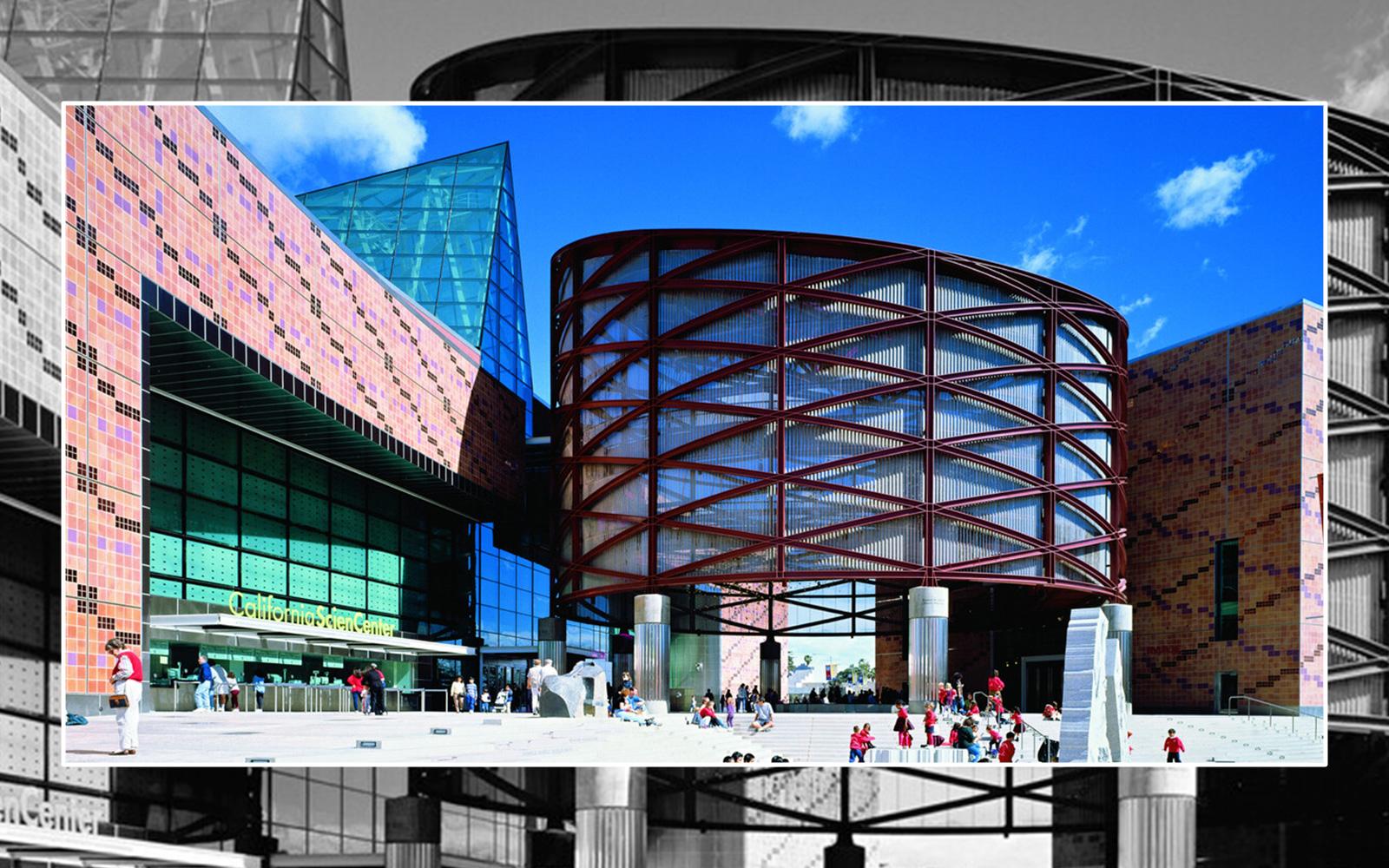
“This is where my preservation stuff really comes out. Originally, there was an armory, Natural History Museum and the Exposition building. They kept the facade of the Exposition building, and constructed this massive thing around it. The integration of the 1912 Exposition building with the new and massive science center was so clunky. I feel the science center is overwhelming. It didn’t relate well to any of the other parts. The way it integrated with the remnants of the expo building was very awkward to me.
“I cringe when I go by it.”
Regal LA Live, 1000 W. Olympic Blvd., Los Angeles
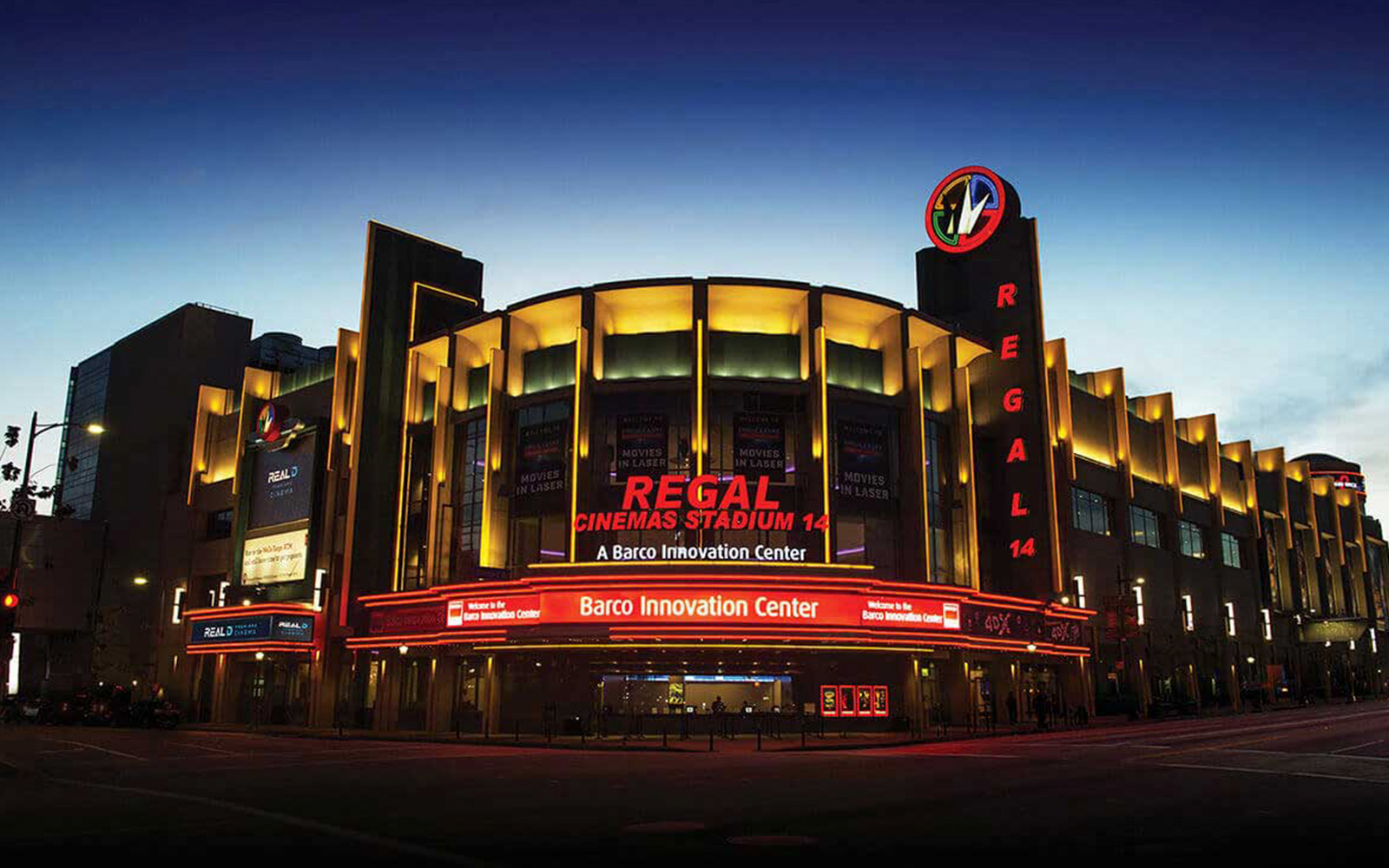
“It was built at the same time as the Ritz Carlton tower, which is a beautiful tower. Then there’s this weird, clunky movie theater that is very prominent from the freeway. I never understood. Why is this revivalistic movie theater next to this beautiful shining sculpture? I’ve seen movies there. It feels cut off from the other components of LA Live. It’s an awkward gesture.”
Brian Kite, Managing Principal, SRK Architects, Inc.
SIGNIFICANT PROJECTS by SRK
California Community Foundation Headquarters Renovation and Adaptive reuse., Los Angeles
Favorite Buildings
Petersen Automotive Museum, 6060 Wilshire Blvd. Los Angeles

“The most important thing (architects Kohn Pederson Fox) did was come up with an extraordinary design, to ‘decorate a windowless box.’ In doing so they brilliantly used the box as backdrop for an overlay of horizontal ribbons of steel reforming the mass of the building. It’s very LA! It gives a whole new reason to go there, even if you don’t like cars.”
Cameo Beverly Hills, formerly Beverly Hillcrest Hotel, 1224 Beverwil Dr., Los Angeles

“This is a building near and dear to my heart designed by my late father Robert Kite. He took what the site was endowed with, a hilltop, and created a dramatic form. It remains today. The hotel was bought by different individuals and while rebranded, retains all the basic form elements that make it unique. It’s a great spot to see Los Angeles from downtown to the beach.”
KPMG Center, 550 S. Hope St, Los Angeles
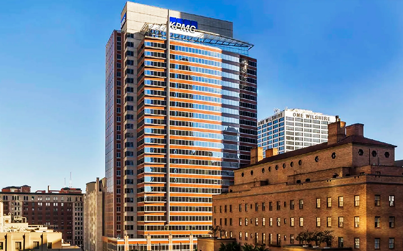
“Los Angeles Just a gorgeous and formidable design which graces Hope Street and stands out as the last building at the terminus of Hope Street at the Downtown LA Library. It’s a ‘contextual building’ that responds to its neighborhood with understated style across from the classic California Club. It is beautifully articulated on the ground floor with an elegant tall lobby opening directly to Hope Street in fully expressed steel, glass and granite.
Least favorite buildings
Westin Bonaventure Hotel & Suites, Los Angeles 404 S. Figueroa St., Los Angeles
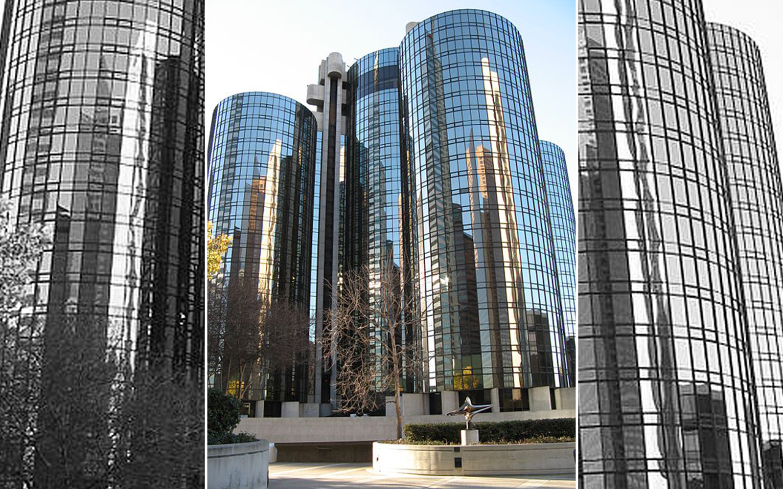
“Everyone’s favorite ‘worst’ building, due to its cavernous interior space and somewhat an example of brutalist architecture on the exterior. Viewed from a distance, the round tower forms accomplish one goal — a postcard picture of DTLA.
“There is little sense of entry as one would expect from a downtown hotel of note. Once In the hotel lobby, there is an echo effect from water fountains which compete for attention from people. Acoustics are terrible and it is difficult to find your way around. One often sees people looking lost – like being in another world.”
West LA Veterans Administration Medical Center, 11301 Wilshire Blvd., Los Angeles
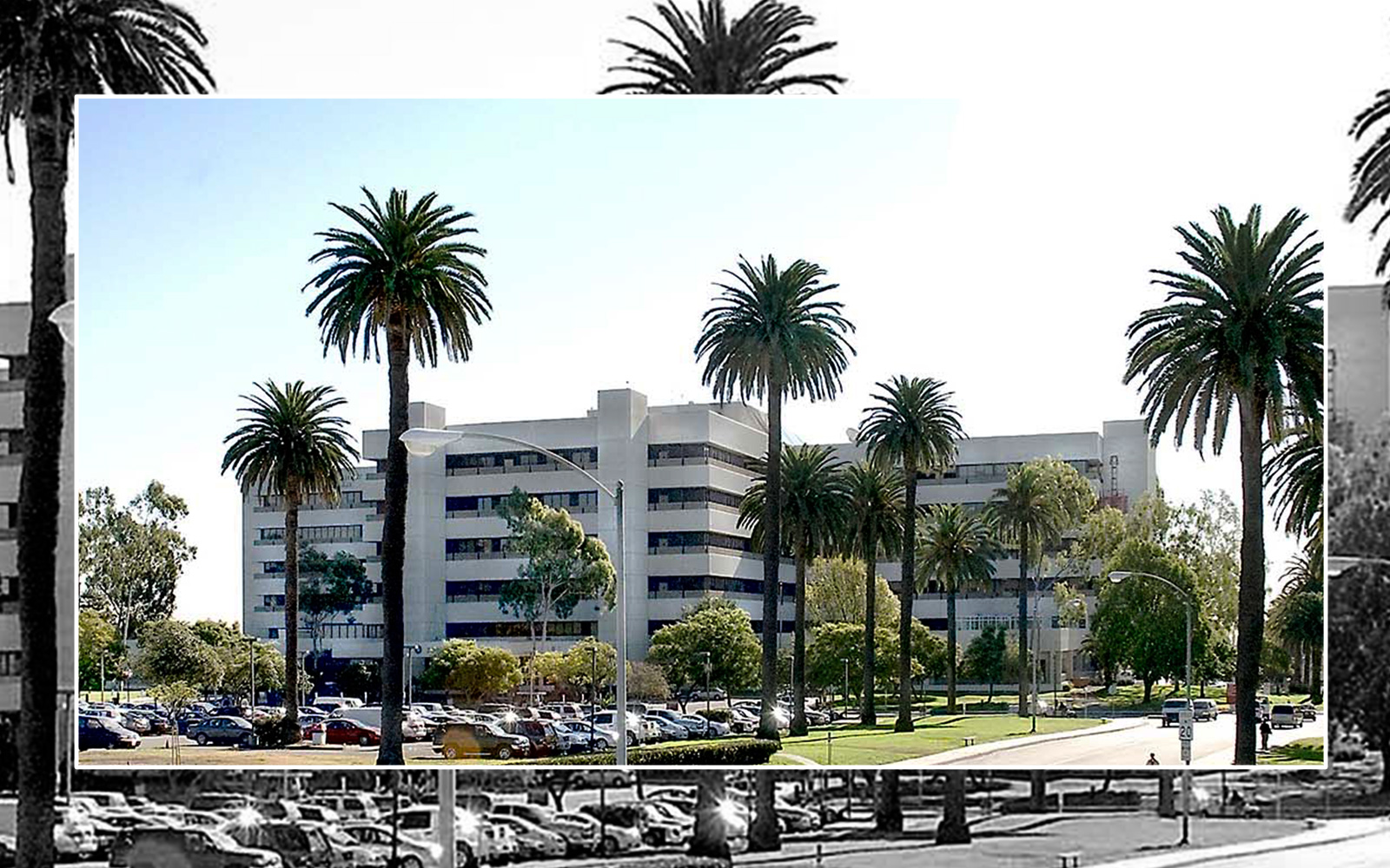
“It’s cruciform. It has four wings appointed with horizontal balcony elements everywhere. Unfortunately, they don’t serve a purpose in a hospital. It’s the same architecture on all sides. As one of the largest buildings in West LA along the 405, you can’t quite get away from it. Hopefully it will be decommissioned someday or simply demolished. Another identical building version in San Diego was made better with exterior seismic bracing. Similar to the Petersen Museum, the architect chose to overlay the building with a new form of spatial logic.”
2711 Wilshire Blvd., Santa Monica

“I’ve appreciated not liking this for some time. Set on a diagonal, no part of the building is normal to Wilshire Boulevard or its cross street. In other words, no element of the building is geometrically resolved to the rectilinear street block that it exists within. As a result, each time I go down Wilshire past this block, a sense of disruption occurs from the sheer discontinuity — just by driving by it. As architects, we almost always work to contextualize the form of our buildings to their environment, however this one in the name of monumentality, does not.”
Read more
