Trending
See every Manhattan demolition between 2003 and 2014
Visual map depicts city's building boom as properties make way for new development

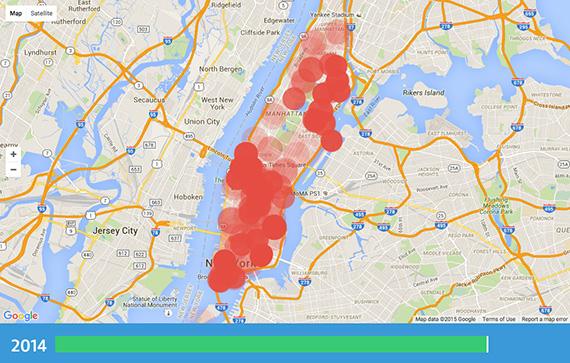
As if we needed more evidence of the building boom that is reshaping the face of New York, a visual map depicting every demolition in Manhattan between 2003 and 2014 puts it all into perspective.
The map, fittingly called “Every Demolition in Manhattan,” uses data culled from the city’s Department of Buildings to depict a striking visual of when and where buildings were torn down in the borough over the 11-year period – to make way, of course, for new development.
The most impressive moments on the map are seen around 2007-2008, according to 6sqft, when demolitions picked up right before the financial crisis brought them to a relative standstill. And then there’s 2013-2014, when it seems like the island explodes into a mushroom cloud of red in the lead-up to our present building boom.
We’ll be looking out for the “Every Demolition in Brooklyn” map, which is sure to be something as well. [6sqft] – Rey Mashayekhi


