From the iconic Reunion Tower, piercing the skyline with its futuristic geodesic dome, to the neoclassical grandeur of the Old Red Museum, Dallas is a tapestry of architectural influences as a city between worlds.
Its architectural journey began in the late 19th century when Victorian and Gothic Revival structures adorned the streets, reflecting an era marked by opulence. The emergence of Art Deco came in the early 20th century as the metro grew into one of the nation’s bustling commercial hubs with gems like the Magnolia Building and the Davis Building leaving a mark on its character. The mid-20th century witnessed the rise of International Modernism, seen in iconic structures such as the West End Historic District’s Bank of America Plaza, the city’s tallest skyscraper.
Today, Dallas continues to evolve, embracing contemporary designs like the Pritzker Prize-winning Winspear Opera House, a showcase of modern architecture coexisting harmoniously with its historical surroundings. Architects have played a crucial role in shaping DFW’s urban landscape, and they often have strong opinions about the buildings that define the city.
We caught up with a few to learn about their favorite locations and least favorite styles that decorate the metroplex.
Evan Beattie, CEO of GFF:
- Favorite: Nasher Sculpture Center

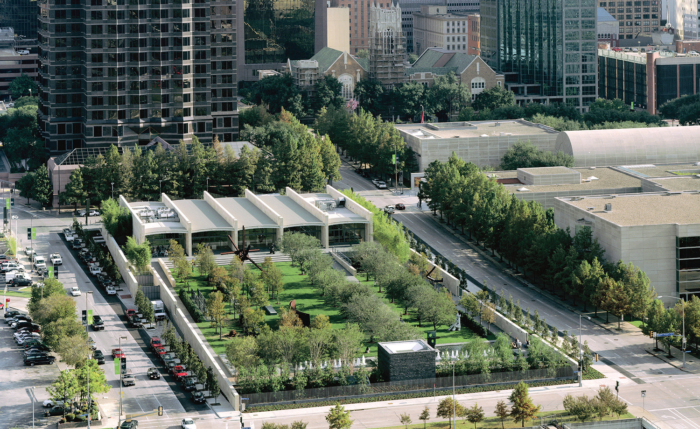
GFF CEO Evan Beattie praises the Nasher Sculpture Center. Designed by Renzo Piano in collaboration with landscape architect Peter Walker, the Nasher Sculpture Center opened in 2003 and stands out among the bold architectural moves in the Dallas Arts District as it subtly stuns atop a nearly 2.5-acre tract next to the Dallas Museum of Art. At two stories, its carefully curated collection includes masterpieces by artists such as Pablo Picasso, Auguste Rodin and Alberto Giacometti.
“Many of the buildings in the Dallas Arts District are designed to feature bold architectural moves, intended to command the attention of passers-by, and in that context the restraint shown by Renzo Piano’s team in the design of the Nasher is commendable,” said Beattie.
But the true pièce de résistance for Beattie is the enchanting sculpture garden that graces the heart of the Nasher as it seamlessly blends the natural world with the artifice of human creation. However, Beattie laments the impact of the luxury development Museum Tower on Nasher’s view where the 40-story tower’s shadow looms over its gardens.
Standing catty-corner Nasher’s travertine stone structure, Museum Tower has famously rendered James Turrell’s “Tending, (Blue)” skyspace concept all but ineffective while creating reflection issues throughout the art gallery. In this clash of architectural wills, Beattie emphasizes a poignant lesson — the significance of being a “good neighbor” when designing in delicate urban landscapes where every square foot counts.
“Museum Tower has negatively impacted such a special art institution in Dallas, which it is named for no less,” he said. “I do hope at some point in the future that a pedestrian entry directly into the Nasher Sculpture garden will be made from Klyde Warren Park, which was completed after the Nasher was built.”
- Least Favorite: Faux Historicism
No one likes a pretender, and Beattie especially doesn’t. False vintage and affected historicism used to emulate a foregone era to the untrained eye have long been bedeviled by architects and aesthetes.
“I have a strong preference for buildings that are designed to be sensitive and complementary to their context, as well as appropriately reflect the era in which they are built,” he said. “Faux historicism in architecture is difficult to do well.”
Christy Blumenfeld, Founder of Blume Architecture:
- Favorite: Highland Park Village

For Christy Blumenfeld, founder of boutique architecture firm Blume Architecture, Highland Park Village — designed by Marion Fooshee and James Clark in 1931 — tops her list of top DFW architectural wonders.
She says she finds herself mesmerized by the sprawling 10-acre village and its Mediterranean colonial aesthetic, which include Spanish plazas arranged around a central fountain.
Meanwhile, live oaks provide a comforting shade, offering a respite from the scorching Texan sun. Imported tile roofs crown the buildings, creating a picturesque harmony between the Mediterranean inspiration and the Texan landscape. Every corner of Highland Park Village is adorned with elements that evoke a sense of history and luxury.
“It has become the heart of Highland … lush landscaping, imported tile roofs, highly ornamental carvings, arched windows, balconies, heavy oak doors and terrazzo floors all finely crafted — this center never disappoints,” she said. “The architectural control allows it to stand the test of time and therefore it’s my favorite built structure in the city of Dallas with Old Parkland coming in a close second.”
- Least Favorite: Buildings that straddle the fence
In true Southern style, Blumenfield refrained from commenting on the work of other architects, dead or alive, who have helped shape the wonder of the DFW metroplex. Instead, she opted for throwing a little shade on architectural fence-sitters.
“My least favorite in general is when a project is neither modern nor traditional. I prefer buildings and homes that are definitely one or the other,” she finished. “I love commitment to design in a way that provides it staying power which I believe comes from using historical style as a precedent.”
Julie Hiromoto, Principal and Director of Integration at HKS:
- Favorite: Webb Chapel Park Pavilion

Julie Hiromoto, a principal at HKS Architects, doted on Webb Chapel Park’s maximalist pavilion, which had earned a special place in her heart long before she relocated to Dallas.
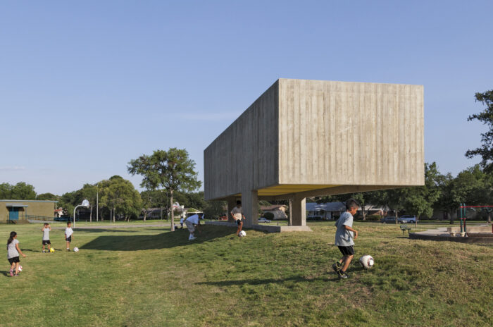
“The pavilion in Webb Chapel Park is a modest structure, but no less impressive in its appearance and function. The bulk of the concrete form appears to float overhead. As you approach, the cheerfully yellow solar chimneys surprise and delight,” said Hiromoto. “Although showing some signs of wear since its construction in 2012, the smart and playful design by Chris Cooper and Wendy Evans Joseph of Cooper Joseph Studio, caught my attention even before moving.”
Cooper Joseph Studio began designing the striking, box-like pavilion to set it apart from the minimalist approach that was the standard for the busy park. . Standing 903 square feet, its cantilevered roof formed of board-formed cast-in-place concrete accomplishes its purpose with style. Decorated with canary yellow coffers outfitted with a conical natural ventilation system, the pavilion offers additional respite for shade seekers in the scorching Texan heat.
In 2019, the World Architecture Design Awards named Webb Chapel Park Pavilion its first-place winner in sports and recreation.
Read more


